

I like this graphic, but on terms of level I think this is slightly lower than your other graphics. I like the hair a lot but you've made Lana's chin very pointy. The top is ok but could use some darker shading as well as the shorts which appear to have minimum shading. The jacket is alright but my main concern is the skin and the background. The background is boring, dull and ugly and the skin is somewhat flat. It needs more of a depth between it and the other areas of skin, clothing and background. (For example, where the hand touches the leg, the legs touch the background, the arm is on the top)
I LOVE the styling. It's something i would wear!... but the graphic this week is not so good unfortunately, I've seen your recent graphics on the graphic vault and you are improving so much, but this one looks extremely rushed, the face is really blurred, it looks like you've done this in a very short amount of time sadly.
Hmmm, I'm not really sure what to think, the graphic is pretty average, and what tips it in that direction is that I don't feel it answers the task, sure it has Lana's face, but other than that I don't see her at all. The face is un-necessarily pointed, and the lips look rather strange, it's the first thing I notice and is a little off putting for the whole graphic. The clothing is fairly average, the shirt shading looks too block-ish, and the shorts - well you've put time in adding the stripes, but then haven't shaded them, they just don't look right without it.
I'm on edge here, to be completely honest here. If I am honest, however, I really only like the hair shading on this graphic. Your clothing shading is rather weak, where the shirt has too much highlighting, and the pants have hardly any shading at all. I think in general, though, its just ok. The only way you'll be able to survive this competition is upping your skills. I'm just afraid you're slipping at such an early time in the game. The one thing I am really happy about, though, is that you actually used a medoll face! Not that you could have made your own face, anyways, but I think for now, stick to the generic stardoll faces. Its not called stardoll graphics for nothing, now is it?...
 Carrie (forevergorgeous)
You definitely need to start trying more techniques, I feel as if you aren't improving at all. you should look at other graphic designers work to see how they shade etc.
I would agree with the above comment. I think your hair is alright but you really need to experiment more with your technique. By this I don't mean try a new technique on the next task and send it in anyway, I mean try out techniques before doing your next task. All your graphics so far have been really simple and quite boring so I want to see something exciting from you.
I'm sorry, but this just doesn't work for me at all. It's not Lana, and it doesn't answer the task. The shading is done to a basic level, and at this stage, and having had a chance to see the other contestants work, you should have upped your game by many many percent, and not the few you have. I don't think I have anything else to say, I guess I'd hoped more from you.
With you, I think your shading isn't.. enough? If you understand what I mean, its just too simple. I'm afraid, if this is an elimination round, you're going to be the one going home. If you don't start experimenting now, I'm not sure what will happen. On the bright side, though, your hair is getting better. I can certainly see you one day being on the top of the food chain, graphic wise. I think you just need more experience.

JACK (forevergorgeous)
Graphically, I don't really have anything to complain about. On the creativity scale it's not your best work but it is nice. I'm not too keen on the hairstyle but the shading of it is nice. Try work on keeping the face less blurry as well.
I love this, It's not your best piece of work (idea wise, the technique is fine) but you never fail to come out on top, the detail in the close up is amazing! you really listened to the brief and I love the clothes, it suits Lana's style down to a T.
1: This is one of the better graphics of all the entries, the shading is simple, yet conveys how it should look without going overboard, and the style almost suits Lana well. I think it almost sits on the fence of being too simple, not in technique, but in general style, which is something which one should be wary about. And just be careful with overall size, I don't think with this image the extra space above the head works. Overall not a bad piece of work. 2: Personally I'm 100% against smoking in relation to Stardoll, so including in graphics, I don't see it as a positive thing or as something to use a* **pressing oneself or ones personality. The image is ok, but my eyes are drawn to the hand, if you're going to do close ups with hands, then it's important to work on them very closely, for example the thumb shape isn't quite there, in the joint I mean, and the shadow under the pinky and ring finger wouldn't just be plain - their would be palmar creases and effects of the bent fingers also. Again the large space above the image doesn't sit right, although the text works with the graphic style.
I actually, really like this! You are really, and I mean, really improving! The shading is near impeccable, however the colarbone on the right graphic could use a bit of improvement. Overall, this is really good. Its amazing how much you've improved!
LUISA (forevergorgeous)
 I will probably get slated for this but I am not too keen on this. I think it's one of your weaker graphic and it just seems slightly rushed. I hope this is just a slip up.
Well I definitely disagree with the comment above. Yes, it does look slightly more rushed than your other graphics but it's definitely not weak. The skin shading is your style however I do not liek the left hand of the doll (right to the eye) because the shading looks awkward. I actually think this is better than Jack's purely because it has more of a stand out factor and more personality. Some other critiques I would make but are down really to personal choices and taste. Good work.
Out of all the Lana graphics, I like this best, to me it works well in style and portrayal of Lana, and I feel it answers the task well. Technique is good, skin is shaded to a good extent, and the hair looks fab! My one criticism is the hands, they both, although particularly the left, look rather large, I don't think they fit the graphic very well. For the most part the clothing is simple, but you have included small details in the shirt beneath the blazer which I like. The blazer shading could maybe use a little work on the shading, I feel it looks a bit chunky. Nevertheless a good effort.
This is definitely a weak graphic. The only thing I really only liked about it was the hair, but that's about it. The hands are really awkward, and the jacket is a bit weird looking too. Honestly I expected more from you. I do, however think this has lots of attitude, and probably is the best "Lana" graphic out of the rest. Although... At the beginning of Season 3, I thought you could easily win this thing, but now I'm not so sure anymore considering the rest of the entries this time. I think you are still safe for a few more rounds, at least, so use that time to take a bit of time to check over your graphics!

The shading in the hair is off, you can do so much better than this. The styling is horrid, I hope this is a mistake.
I sort of like this. It's very smooth, and you've managed to incorporate this doll into a slightly interesting graphic. The hair shading is ok but my main concern about it is the colour. It really does not suit the doll and looks odd against the other sandy coloured tones of the graphic. I wish there was more of a contrast between the doll and the background, because in this graphic the only thing that really stands out to me are the lips/lipstick. I like the technique used on the hands, but there is a big lack of attention to detail on the hands here.
Ew, that's probably the only thing I can see at a first glance. Honestly, I think the shading (other than the hair and lipstick tube), was pretty poor. The face shading was rather bland too. At this point, I think you are only holding up by a few strings. I'm not sure what happened, your graphics seem to have had a downfall. Seriously, what happened?
I don't see this as answering the task, you were to focus on the face, their style and them as an individual, and I think you've only understood to portray the face. I think this is too largely focused on the face, and when a graphic is like that every little detail in the facial shading and the hair need to be perfect - unfortunately I just don't think it works that well here. The hands are the best part of the graphic, which pleases me, but the coat and hair are a bit of a let down, they are pretty simple and lack fine details, which is a shame. I think the same pose would have looked nice as a full body image, but I think you've misunderstood the task as being a beauty shoot.

EMMA (iluvladygaga232)
This is too boring me for me, I think you've tried to go with the simplicity style but it hasnt worked, the shading and shorts are nice though. I've seen you do alot better.
It's a nice enough graphic but it is very bland. The background is very boring and it really contradicts the image. The graphic seems very laid back and chilled but she's on a plain black background which looks really bare and cold. Graphically, it is not flawless but it's alright. The late entry was annoying considering you had 16 days to complete the task so sadly I will have to deduct points for it. The shading for the legs, boots, shorts, hair are nice but the top looks flat and the cardigan looks bland. There is also a lack of shading at the chest area. A bit of a step down but not too bad.
Hmm... I'm on the fence here. The hair is fabulous, but other than that, everything is just so... plain. The legs are waaay to highlighted compare to the rest of the body, and I don't really prefer "plastic" legs. If the pants had heavier shading, perhaps I'd like them. Other than that, I can't really say much else.
This is quite a cute graphic, but again I'm not sure it answers the task, I don't see it as iluvladygaga's style, but that might just be me. The hair is pretty good, but I wouldn't add the hat, it doesn't work with the rest of the style of the outfit. The clothing isn't too bad, but generally lacks detailed shading, as does aspects of the skin, for example the lack of knees. It's not bad, and I think the places which need work, can be easily worked upon.
RAFAEL
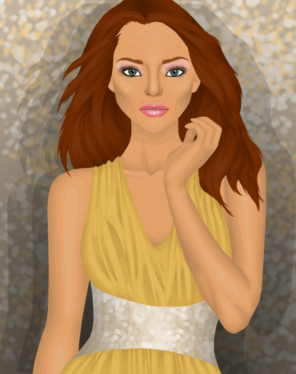
I'm slightly disappointed by this graphic. I really like your hair technique, although I dislike the hair colour. I also really dislike the colour of the dress as it fades in too much, if the dress were a different colour you possibly could have a mark higher. Pull your socks up rafael!
As much as I hate to say this, this is a step down. The skin is a strong point and the hair is nicely shaded. Once again though a very bare chest area besides the lovely collar bone. Even the dress shading is weak and this is usually a standout point of yours. I really dislike the belt as it looks very bare. I think you have the same problem as Joao, it doesn't stand out enough. As nice as the skin/hair/doll is it just merges into the background.
I love the hair! And the skin shading is excellent too! The dress could use some work, but other than that I honestly don't have too many complaints. Its just that dress, if it were a different color, and maybe had slightly better shading, it'd be a whole lot better. Other than that, fantastico!
I don't like this at all, I think the technique is average and the conveyance of style isn't there. It looks very basic and like a generic picture, not something that portrays and individuals style. I think the dress attracts quite a lot of my attention in a negative way, it's not something that's typically stylish and it's shaded rather weakly, the silver belt/waistline looks rushed and, well, to me, kinda odd, I don't think it fits with the rest of the dress style.

I really like this kasey! I was worried that your graphics were slipping but you saved yourself by making this graphic, the model doesnt have a very model like face, but you worked with it really well, love the skin and hair, you chose a good background too!
YAY! This is the Kasey I'm looking for. Your graphic last task was quite boring but I love this. The shading is amazing and I absolutely adore the bracelet. I actually love a lot of things and there isn't really anything I think you could improve on apart from the shorts. I also really like how you've opted for a nice background. It really adds a whole new depth with backdrops like this. I have so many positives to say but I'm just going to end it here with a huge well done!
Oooohhh myyyy goooddd! Gorgeous Kasey! I've been waiting for you to do something like this, and now, you have. The shading is near impeccable, although my one complaint? The short shading is a bit off, or maybe because I like structured pants. My favorite part? It'd probably be those gorgeous boots! Add a nice drop shadow, and this would be a solid ten!... With that, here's my rating:
This is a good graphic and shows the strongest technique of the bunch, but I don't think it conveys iluvladygaga's style quite right. However I think this can be let slip a little with the strength of the technique and attention to detail, the bracelet in particular catches my eye in a very positive light, and the hair is super super pretty! The one little niggle I have is in the left arm and bag, I think neither fit the graphic, and it would still look good with them omitted. I like the addition of makeup, but the face seems a little flat. Overall a good entry.


