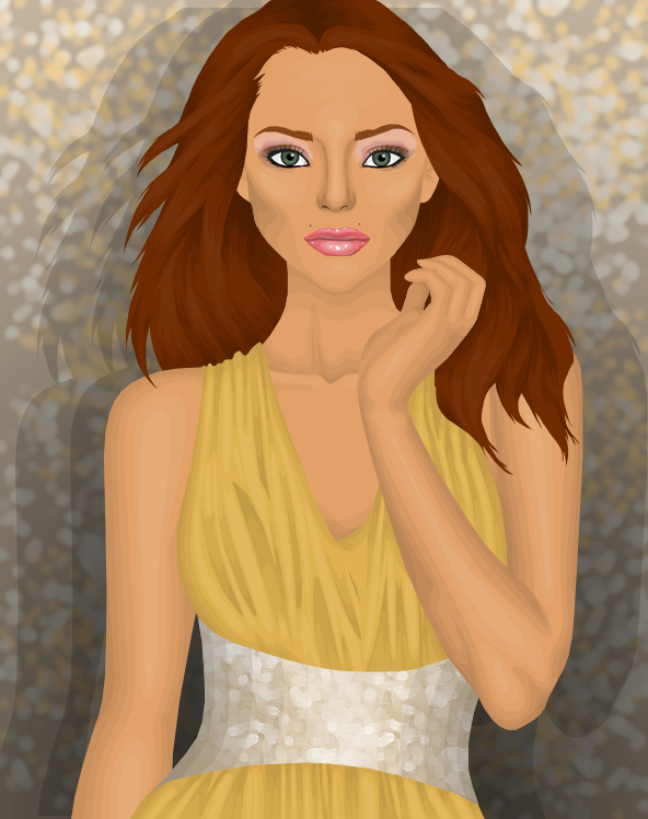
Showing posts with label Elimination. Show all posts

Monday, 15 April 2013

TASK SIX - Elimination + Final Task

What I've done this week is included all the feedback but highlighted the most important bits. If you're a reader but don't want to read the entire feedback just skim over the highlighted parts! Please note that Luisa and Jack are tied first place. I'd also like to add that Luisa's banner can be seen at TTT now.


LUISA #1

Lindsey: This is definitely, without a single doubt my favorite entry of the three. You incorporated the perfect amount of neon yellow and I can certainly tell you are starting to earn your own style back once again. I especially favor Kim's skirt and Khol's hairstyle. For some reason, you, along with the other two contestants have all seemed to create a trend--your faces are just extremely blurry. The text is fantastic as well, I love how you had Kim sitting on the TTT! Despite little mistakes, a perfect score won't be demolished!

Kimberly: The reason why I didn't put top photos on Jacks is because yours is equally as beautiful! You have the perfect amount of the neon yellow and I just love the style and originality of the graphic and your technique. First of all, I love how you have the doll sitting on the text! I love pretty much everything about my doll aside from the blurry face and hair, which pulled it down slightly. I think Khol looks fantastic too, although once again a blurred face. The neck looks slightly too large but I can't fault your technique at all. I'd also say the text looks slightly flat and could use some bevel of some sorts. Well done!

Monday, 8 April 2013

TASK FIVE - Elimination + Task Six

TOP PHOTO: Jack
Kimberly: Wow. This is astonishing! I understand you have problem with hair but keep experimenting with techniques and you'll find the one that works for you. I also think the shading is a big too dark on the male's torso and it's slightly distracting from the female who is the main point of the graphic. An amazing job though!

Khol: Well well well, you've done it again! I dont think you can improve any more to be honest. The shading is fantastic and I LOVE how you included a male model. It looks so realistic it's crazy! I suppose the only thing you should work on is hair, but you're definitely getting there! Cute, amazing, hot!

Lindsey: Can I just say WOW? Just the sight of that dress instantly sends chills down my spine. I like want it. Now.  With that said, you understand my perspective on your graphic. The hair of both models could use work, but I understand that this comes to a challenge to you. Just keep on experimenting, and you'll go far! The shading is impeccable, though maybe the highlighting is too bright though. I also noticed the legs on the female model are really skinny, and maybe a bit too far apart. This can be a quick and easy fix. Of course, any model for a high end designer has noodle legs and arms, if you understand what I mean... Also, before I finish, I wanted to express the fact that since this is a stardoll graphic competition, I think it'd be better if you used more medolls instead of real people. Although, the fact that you can make realistic faces almost perfectly is admirable.

Kirsten: I love the female model and everything about her, but I feel the male pulls her greatness down a little, I feel it’s the shading of his side closest to her, it’s quite dark so it draws my eyes to it. Otherwise, the technique and skill used are great, and it’s a fab graphic – so graphically, no faults, but my one qualm is how real it looks, almost too real for me to classify as a Stardoll graphic – I get that it wouldn’t have been the same with a Stardoll face, but I think in a Stardoll graphics competition there should have been a little more Stardoll. But overall great job!

CONTINUED AFTER BREAK!

Tuesday, 19 March 2013

TASK FOUR - Results

TOP PHOTO: Luisa
Wow Luisa! This looks scarily real! I can definitely tell this is Italy. I'm quarter Italian so i was very excited to see how you would portray my origins. The shading is fantastic, The angle is a little strange although the clothes and hair are gorgeous aswell as the beautiful background. netherless, buon lavoro! 

It does seem ‘Italy’, but I’m not sure I like the graphic, which I myself am surprised at as I’ve always been a fan of your work! Like Rafi’s, I don’t like the RL background, I just don’t think it fits with the good quality of your work. I feel like the head seems a little large, and I don’t feel the model works with the look, I just don’t think she was the right choice. My favourite part is the bag- just beautiful! However it doesn’t fit with the style of the clothing or other accessories used. I’m not sure on the top, I just think it’s not quite right – the shading is fine, but I think the print isn’t. The skirt confuses me a little as I don’t think it is portraying the shape that the model is I think just some little adjustments to the shading would be needed to correct that. The shoes are very nice though. You’re always good with the skin, but I’d just suggest to be careful at the neck with the angles of the collarbones and muscles and ligaments in relation to the angle of the head. Overall not bad.

This is a very good angle of not having to use complicated and excessive shading to make the graphic look good. In this case I really like the use of the background as it has been edited to fit the graphic with the brick wall and villa floor. I adore everything but the angle of the graphic makes some things look slightly awkward. I wasn't too sure of the print from the top when I first saw it but it is growing on me! I'd also make sure to study the angle properly as the collar bones do not fit with the head too well. I definitely see Italy so well done!


2ND PHOTO: Jack
It’s a good graphic, there’s no denying that, but from a personal point of view I don’t really like it. I feel Japan had many aspects which could have been followed and you took the one which was obvious, if you get what I mean, it would have been great to see you do something more out of your comfort zone with it, there’s a heavy cute-sy vibe that comes from a lot of Japanese females, and I think that would have given it the wow factor as it would have been unexpected. I feel the face mask takes away from the I don’t think it fits the style well, it seems a bit too gansta! Otherwise not bad.

I love this graphic and that mask looks so fierce, extra points for doing some background research with the graphic! I do kind of agree with the comment above but at the same time I like the direction you went in. Most people when given Japan would go for that cutesy vibe that does come from the country but instead you went for another side of the fashion culture, similar to how you do for all your graphics. So I am on the fence, I like how you didn't go for what most people would but at the same time I wish you did because you never do. On a whole though and graphic wise I can honestly say nothing to improve on.

When are you gonna stop being so damn talented? like for real, this is just perfecto. My medoll looks hot and the graphic is hot hot hot. I knew you would smash this task, and you have. The shading is brilliant as always, the hair is amazing. The idea its self is the best, most of us probably predicted geishas and pretty birds and all that crap, or maybe gwen stefani/nicki minaj style "super kawaii!" as gwen would say. But you came out with this grungy yet kawaii style graphic which is literally just breathtaking. Honto ni suki desu!


3RD PHOTO: Kasey
To be honest, I don’t like this at all. I think the idea is fine, but for me, not in a contest. Each of the 4 graphics in their own right are quite nice and have been well done, especially the cobalt shoe, but I think what lets it down in the arrangement and presentation. I feel the font looks a bit ‘young’, if you want to portray fashion, a high fashion font is a must! I don’t feel there’s much more to say about it, but good attempt at something different.

I like how you took a different spin of it. Out of the two entries given this was the better one however I still agree it could have been presented slightly better. However I do like how it resembles a fashion scrapbook at "Spanish fashion world". Separately I love the graphics and overall together I do love the presentation. I also loved your creativity for this task, I've definitely never seen something like this before.

Well well well, we got the old Kasey back! This is Kholicious! I love the fact you didnt use a model. I love stuff like this, using your creativity to the full is the key to success. The shading on all of the graphics is perfect, the idea is amazing. theres not really much to say! Being half spanish myself, I love how sexy and fashionable you portray my culture to be! SUPERB.


4TH PHOTO:
I must admit, If this were in a magazine, I wouldn't stop to look. You could of done so much more with this! I am slightly disappointed but nevermind. It does seem quite rushed but I don't know the reason why so I wont judge you, The shading is well done, the hair is boring. I feel like you picked the easy way out. The dress is cute though. The background, hm it looks cheap. Posterising is great for backgrounds but this one is not so good. Overall though you did a good job, just not as good as you've done before.

Graphic wise you are very talented and you now how to construct a great graphic but this lacks any real wow factor or excitement that many of your other graphics bring. Starting with the positives, I love the shoes. The dress is shading nicely although in quite a mediocre fashion. This is the technique a lot of graphic artists used to use and I do like, but I'd love to see you experiment slightly with the skin. I'm not too fond of the face or hair and the posterisation on the background does not work for me. All in all this graphic doesn't click together. You've went for the obvious use of the Eiffel tower in the background with a clever usage of Dior but I would have loved to have seen you incorporate the lovely dress into more of an exciting pose rather than a runway walk. I also like your use of the shadow.

Hmmm, I’m a little on the fence. Firstly I don’t like the background, I think it detracts from the graphic, you could have at least used the SD Eiffel Tower scenery background. Without the background though I don’t see France at all really, which is a shame, as I think you have improved with this piece of work. The skin is pretty good, and the dress is a much needed step up in your work! And it’s good to see the inclusion of the shadow, I think without it, it would be rather odd! I’m impressed with your work this week, but just remember that background is included in the piece!

BOTTOM TWO: Joao
It’s ok, I don’t see any part that leaps out as a wow or anything though. Although I find the use of a RL pillar a bit … annoying/distracting, all I can see/ think about is how it doesn’t work with any of the rest of the graphic. It was a nice idea to show the two views, though I think if you’d spent more time on just one it could have been a better piece of work. I feel you need to work on all aspects of your graphics, the hair is ok, but you need to work on a more natural shape and shading technique. The skin is average, but be careful when you are trimming the edges, as you haven’t done this! And the sharp corners and parts where the colour is different to the background are quite obvious. You also need to work on the collarbones, you just haven’t understood their anatomy at all, I think you’ve looked at what others have done and replicated it without considering how your graphic is positioned, you need to spend time on something like this otherwise it won’t look right. The dress is ok, the shape and folds are quite nice, but more layers to provide depth would have made it nicer, again, it just needs more time. I think the belt and little shoulder décor needed more work too, they look pretty flat, and assuming they are flowers, they should be anything but – unless it’s a flat belt, it which case the details you have included shouldn’t be there. Not bad, but you need to think about upping your game.

I definitely think you should have stuck to one graphic or displayed both of them in a more pleasant way. Starting off with the left graphic, which I prefer; Firstly I like the shading of the dress, white is a hard colour to shade due to the fact you can't highlight so you have to really focus on where you put your shading.The skin shading is average however be careful not to chop it too short as the skin extends further than the shading itself in some parts of your graphic. The hair is alright but the pillar doesn't really merge with the rest of the graphic and I think you could have focused more on incorporating it better into your image. On the second graphic, the dress is once again very nice. The skin shading is a lot nicer on this graphic but it is still choppy around the edges. The neck is far too fat for the head and extends too far across making the heads positioning very weird. The hair is alright again and the background fits much better than the left graphic. My main concern are the collar bones. They are completely off and you clearly haven't understand the anatomy of them in this graphic at all. They really put me off this graphic as otherwise it would have been quite nice. Well done for making two graphics though!

This is pretty Cliche, netherless gorgeous! You could of experimented with the culture and tried something less popular as this sort of style. The dress is super gorgeous but i dont really like the hair. A nice long wavy brunette hairstyle would of completed the graphic. The background is cute aswell!

BOTTOM TWO: Afrin
The first thing I noticed about this graphic is the hair. The styling is nice but it looks very noticeably choppy and rough. I hate this background, gradient backgrounds hardly ever work and I don't think this background at all shows South Africa. I like the text but the background takes away from that. Moving onto the doll, Kirsten looks fierce! You've used her face really well! I like the blazer but it once again looks slightly choppy, along with the lace top (?). I feel like the pants are your take on SA but I honestly do not see it. You say traditional but this pattern on the trousers just look like random effects found on a photo editing software? If you had a different background and focused more on creating a South African vibe from the trousers and graphic in general this would have been really nice. There was SO much you could have done with this and you could have included so many things like patterns and cultural accessories but it completely lacked them.


To be honest I see no resemblance to SA whatsoever, which is disappointing. As the model featured I also am disappointed, you have featured me wearing a lace bra and blazer with rather a lot of flesh showing, when I am asked to model or when I apply, I make it clear that I wouldn’t want to be seen in this situation, so I feel that you should have asked if this was appropriate – considering in the first task you complained that Marloes Horst photos were mainly in swimwear which you couldn’t do for your own reasons, to me it just is contradictory of you. The graphic is ok, nothing too spectacular. The jacket is the best part, though there are some areas which look like they have been rushed, as there is a mixture of levels of detail. The trousers just look weird to me, and not SA at all – I can see you were going for prints, but that’s not the right print, it’s important to do your background research well!

Damn girl, what happened? It's great that youve spent time on the graphic, but i couldn't even tell it was south africa! I don't know what you were trying to portray but i can't see it at all. Maybe it was the printed trousers? I would of gone with a nice african backround with an amazingly patterned outfit and some cultural accessories. I'm just really disappointed in this. It's still a good graphic in general though! I like the hair and shading, and kirsten looks hot!

Who goes?
... Afrin. Well done for making it this far! We see your beautiful graphics out of this competition and we just don't feel that the same goes into these ones. Joao, well done, you literally made it by the skin of your teeth as you were less than 5 points between each other. However good work Afrin, and we will continue to enjoy your wonderful graphics out of the competition.

More information on the task and rankings will be posted tonight.

Saturday, 23 February 2013

TASK THREE - Results

Afrin (forevergorgeous)
I like this graphic, but on terms of level I think this is slightly lower than your other graphics. I like the hair a lot but you've made Lana's chin very pointy. The top is ok but could use some darker shading as well as the shorts which appear to have minimum shading. The jacket is alright but my main concern is the skin and the background. The background is boring, dull and ugly and the skin is somewhat flat. It needs more of a depth between it and the other areas of skin, clothing and background. (For example, where the hand touches the leg, the legs touch the background, the arm is on the top)

I LOVE the styling. It's something i would wear!... but the graphic this week is not so good unfortunately, I've seen your recent graphics on the graphic vault and you are improving so much, but this one looks extremely rushed, the face is really blurred, it looks like you've done this in a very short amount of time sadly.

Hmmm, I'm not really sure what to think, the graphic is pretty average, and what tips it in that direction is that I don't feel it answers the task, sure it has Lana's face, but other than that I don't see her at all. The face is un-necessarily pointed, and the lips look rather strange, it's the first thing I notice and is a little off putting for the whole graphic. The clothing is fairly average, the shirt shading looks too block-ish, and the shorts - well you've put time in adding the stripes, but then haven't shaded them, they just don't look right without it.

I'm on edge here, to be completely honest here. If I am honest, however, I really only like the hair shading on this graphic. Your clothing shading is rather weak, where the shirt has too much highlighting, and the pants have hardly any shading at all. I think in general, though, its just ok. The only way you'll be able to survive this competition is upping your skills. I'm just afraid you're slipping at such an early time in the game. The one thing I am really happy about, though, is that you actually used a medoll face! Not that you could have made your own face, anyways, but I think for now, stick to the generic stardoll faces. Its not called stardoll graphics for nothing, now is it?...


Carrie (forevergorgeous)
You definitely need to start trying more techniques, I feel as if you aren't improving at all. you should look at other graphic designers work to see how they shade etc.

I would agree with the above comment. I think your hair is alright but you really need to experiment more with your technique. By this I don't mean try a new technique on the next task and send it in anyway, I mean try out techniques before doing your next task. All your graphics so far have been really simple and quite boring so I want to see something exciting from you.

I'm sorry, but this just doesn't work for me at all. It's not Lana, and it doesn't answer the task. The shading is done to a basic level, and at this stage, and having had a chance to see the other contestants work, you should have upped your game by many many percent, and not the few you have. I don't think I have anything else to say, I guess I'd hoped more from you.

With you, I think your shading isn't.. enough? If you understand what I mean, its just too simple. I'm afraid, if this is an elimination round, you're going to be the one going home. If you don't start experimenting now, I'm not sure what will happen. On the bright side, though, your hair is getting better. I can certainly see you one day being on the top of the food chain, graphic wise. I think you just need more experience.


JACK (forevergorgeous)
Graphically, I don't really have anything to complain about. On the creativity scale it's not your best work but it is nice. I'm not too keen on the hairstyle but the shading of it is nice. Try work on keeping the face less blurry as well.

I love this, It's not your best piece of work (idea wise, the technique is fine) but you never fail to come out on top, the detail in the close up is amazing! you really listened to the brief and I love the clothes, it suits Lana's style down to a T.

1: This is one of the better graphics of all the entries, the shading is simple, yet conveys how it should look without going overboard, and the style almost suits Lana well. I think it almost sits on the fence of being too simple, not in technique, but in general style, which is something which one should be wary about. And just be careful with overall size, I don't think with this image the extra space above the head works. Overall not a bad piece of work. 2: Personally I'm 100% against smoking in relation to Stardoll, so including in graphics, I don't see it as a positive thing or as something to use a* **pressing oneself or ones personality. The image is ok, but my eyes are drawn to the hand, if you're going to do close ups with hands, then it's important to work on them very closely, for example the thumb shape isn't quite there, in the joint I mean, and the shadow under the pinky and ring finger wouldn't just be plain - their would be palmar creases and effects of the bent fingers also. Again the large space above the image doesn't sit right, although the text works with the graphic style.

I actually, really like this! You are really, and I mean, really improving! The shading is near impeccable, however the colarbone on the right graphic could use a bit of improvement. Overall, this is really good. Its amazing how much you've improved!


LUISA (forevergorgeous)
I will probably get slated for this but I am not too keen on this. I think it's one of your weaker graphic and it just seems slightly rushed. I hope this is just a slip up.

Well I definitely disagree with the comment above. Yes, it does look slightly more rushed than your other graphics but it's definitely not weak. The skin shading is your style however I do not liek the left hand of the doll (right to the eye) because the shading looks awkward. I actually think this is better than Jack's purely because it has more of a stand out factor and more personality. Some other critiques I would make but are down really to personal choices and taste. Good work.

Out of all the Lana graphics, I like this best, to me it works well in style and portrayal of Lana, and I feel it answers the task well. Technique is good, skin is shaded to a good extent, and the hair looks fab! My one criticism is the hands, they both, although particularly the left, look rather large, I don't think they fit the graphic very well. For the most part the clothing is simple, but you have included small details in the shirt beneath the blazer which I like. The blazer shading could maybe use a little work on the shading, I feel it looks a bit chunky. Nevertheless a good effort.

This is definitely a weak graphic. The only thing I really only liked about it was the hair, but that's about it. The hands are really awkward, and the jacket is a bit weird looking too. Honestly I expected more from you. I do, however think this has lots of attitude, and probably is the best "Lana" graphic out of the rest. Although... At the beginning of Season 3, I thought you could easily win this thing, but now I'm not so sure anymore considering the rest of the entries this time. I think you are still safe for a few more rounds, at least, so use that time to take a bit of time to check over your graphics!


JOAO (iluvladygaga232)
The shading in the hair is off, you can do so much better than this. The styling is horrid, I hope this is a mistake.

I sort of like this. It's very smooth, and you've managed to incorporate this doll into a slightly interesting graphic. The hair shading is ok but my main concern about it is the colour. It really does not suit the doll and looks odd against the other sandy coloured tones of the graphic. I wish there was more of a contrast between the doll and the background, because in this graphic the only thing that really stands out to me are the lips/lipstick. I like the technique used on the hands, but there is a big lack of attention to detail on the hands here.

Ew, that's probably the only thing I can see at a first glance. Honestly, I think the shading (other than the hair and lipstick tube), was pretty poor. The face shading was rather bland too. At this point, I think you are only holding up by a few strings. I'm not sure what happened, your graphics seem to have had a downfall. Seriously, what happened?

I don't see this as answering the task, you were to focus on the face, their style and them as an individual, and I think you've only understood to portray the face. I think this is too largely focused on the face, and when a graphic is like that every little detail in the facial shading and the hair need to be perfect - unfortunately I just don't think it works that well here. The hands are the best part of the graphic, which pleases me, but the coat and hair are a bit of a let down, they are pretty simple and lack fine details, which is a shame. I think the same pose would have looked nice as a full body image, but I think you've misunderstood the task as being a beauty shoot.


EMMA (iluvladygaga232)
This is too boring me for me, I think you've tried to go with the simplicity style but it hasnt worked, the shading and shorts are nice though. I've seen you do alot better.

It's a nice enough graphic but it is very bland. The background is very boring and it really contradicts the image. The graphic seems very laid back and chilled but she's on a plain black background which looks really bare and cold. Graphically, it is not flawless but it's alright. The late entry was annoying considering you had 16 days to complete the task so sadly I will have to deduct points for it. The shading for the legs, boots, shorts, hair are nice but the top looks flat and the cardigan looks bland. There is also a lack of shading at the chest area. A bit of a step down but not too bad.

Hmm... I'm on the fence here. The hair is fabulous, but other than that, everything is just so... plain. The legs are waaay to highlighted compare to the rest of the body, and I don't really prefer "plastic" legs. If the pants had heavier shading, perhaps I'd like them. Other than that, I can't really say much else.

This is quite a cute graphic, but again I'm not sure it answers the task, I don't see it as iluvladygaga's style, but that might just be me. The hair is pretty good, but I wouldn't add the hat, it doesn't work with the rest of the style of the outfit. The clothing isn't too bad, but generally lacks detailed shading, as does aspects of the skin, for example the lack of knees. It's not bad, and I think the places which need work, can be easily worked upon.


RAFAEL
I'm slightly disappointed by this graphic. I really like your hair technique, although I dislike the hair colour. I also really dislike the colour of the dress as it fades in too much, if the dress were a different colour you possibly could have a mark higher. Pull your socks up rafael!

As much as I hate to say this, this is a step down. The skin is a strong point and the hair is nicely shaded. Once again though a very bare chest area besides the lovely collar bone. Even the dress shading is weak and this is usually a standout point of yours. I really dislike the belt as it looks very bare. I think you have  the same problem as Joao, it doesn't stand out enough. As nice as the skin/hair/doll is it just merges into the background.

I love the hair! And the skin shading is excellent too! The dress could use some work, but other than that I honestly don't have too many complaints. Its just that dress, if it were a different color, and maybe had slightly better shading, it'd be a whole lot better. Other than that, fantastico!

I don't like this at all, I think the technique is average and the conveyance of style isn't there. It looks very basic and like a generic picture, not something that portrays and individuals style. I think the dress attracts quite a lot of my attention in a negative way, it's not something that's typically stylish and it's shaded rather weakly, the silver belt/waistline looks rushed and, well, to me, kinda odd, I don't think it fits with the rest of the dress style.


KASEY
I really like this kasey! I was worried that your graphics were slipping but you saved yourself by making this graphic, the model doesnt have a very model like face, but you worked with it really well, love the skin and hair, you chose a good background too!

YAY! This is the Kasey I'm looking for. Your graphic last task was quite boring but I love this. The shading is amazing and I absolutely adore the bracelet. I actually love a lot of things and there isn't really anything I think you could improve on apart from the shorts. I also really like how you've opted for a nice background. It really adds a whole new depth with backdrops like this. I have so many positives to say but I'm just going to end it here with a huge well done!

Oooohhh myyyy goooddd! Gorgeous Kasey! I've been waiting for you to do something like this, and now, you have. The shading is near impeccable, although my one complaint? The short shading is a bit off, or maybe because I like structured pants. My favorite part? It'd probably be those gorgeous boots! Add a nice drop shadow, and this would be a solid ten!... With that, here's my rating:

This is a good graphic and shows the strongest technique of the bunch, but I don't think it conveys iluvladygaga's style quite right. However I think this can be let slip a little with the strength of the technique and attention to detail, the bracelet in particular catches my eye in a very positive light, and the hair is super super pretty! The one little niggle I have is in the left arm and bag, I think neither fit the graphic, and it would still look good with them omitted. I like the addition of makeup, but the face seems a little flat. Overall a good entry.


Monday, 17 September 2012

TASK FOUR - Results

Hello patient followers! After a rough 3-ish weeks, I'm happy to finally draw a close to a very stressful fourth task (and first task since I've taken co-ownership for SNTGD). Unfortunately, I had two lovely contestants resign during this short period of time, though, I'm proud to welcome back a familiar face to take place of one of the resignated artists... Please give a warm welcome back to Elle, also known as RockinEllee!

For Task Four, the contestants were deemed with the challenge of creating a logo/banner for season two of Stardoll's Next Top Graphic Designer. For more information regarding the task, click HERE to view instructions given to the contestants.

TOP PHOTO; Rralucaa1996
Lindsey: Marie, this is absolutely my favorite from the task! Especially considering you made this marvelous piece in only one day's length of time. I love the purple color scheme, and pretty much every aspect is spot on. While the left (or on Maria, it would be her "right") arm, the shoulder is a little bit in a strange position. Its hardly noticeable, but something to keep in mind. I'm so happy that you've found a new elegance in your graphic, but I want to let you know that you shouldn't be afraid to show your true style, others will appreciate it! Congrats on a first task win!, 9/10

Kasey: I LOVE this! Those hands are so well made and the bold blast of color on her lips was a smart idea. Though, the thing that troubles me is the anatomy of the upper body. She doesn't look like she has any breasts. And while models may have smaller ones, and the hair is supposed cover them, there would be some sort of shading there to signify the presence of well, ****ies. Well, I have to say, you did an amazing job, so I believe you deserve a very nice 8.5/10!

Kirsten: I'm a bit on the fence with this, there are parts I like and parts I don't. With the body/skin I love the arms, hands and neck, I think these are so close to perfect, but I don't really like the torso, it seems a bit off shape-wise to me. The skirt style is really cute and trendy, and the shading isn't too bad either. I just don't like the hair, the shape is fine for the graphic, but I don't like the shading - I know I'm not really one to speak as my hair skills are abysmal, but it looks a little ... flat maybe. Not too sure about the model choice - she just looks a little angry to me! The general theme is quite good though. 6/10

GRAPHIC'S SCORE; 23.5/30
TOTAL SCORE; 92.5/130


SECOND PLACE; RockinEllee
Lindsey: Welcome back Elle! Huge improvement from last week! I love how you've decided to use multiple medolls in this graphic-- that's truly a creative touch! While the skin shading could definitely use some improvement, there are some really good things in this graphic too! If there is one thing that you could really work harder on, it'd be face shading. The face is a bit brighter shade of color from the rest of the body, and has hardly any shading, of course except for the nose, which is overly shadow-ed. As the finale draws closer, I want all the contestants to be aware of what their true style is, and I hope you have found yours! That is what shines above all, so embrace it. Great job, 7/10.

Kasey: Welcome back, Elle:D This is so simple, but so beautiful! I love the background (partially because I'm in it) but I love how you incorporated other graphic designers into the header. No one else did that, so be proud! The shading is something I'm worried about, though. I looks a little messy and could use some work, but when zoomed fully out, it works. The hair is my favorite part of this background! It's beautiful and you did very good on it! 7/10! 

Kirsten: I love the whole thing, I think it's fab! It shows so much improvement from your other entries. I love the concept, it's simple but has been executed well. The graphic looks great, the skin has been shaded well and there is good detailing on the hand. I praise your use of the colour black in both the skirt and the hair as it's hard to shade and highlight well, but I think you've managed really well! I also think the text choice was good, this may not matter to some people, but I think it can really pull a graphic one way or the other, and it pulls it into the "Great" category for me, well done =) 9/10

GRAPHIC'S SCORE: 23/30
OVERALL SCORE: 87/130
THIRD PLACE; Hollyoaksrocks*
Lindsey: Wow, look how fierce this is! I love, love, love how you took a risk in using your own medoll. I've always wanted to be an inspiration to others, so I applaud you for showing that in a graphic. Unfortunately, this isn't one of your best tasks. The dress looks rather poorly made, although I won't be afraid to admit I'd love to own a dress like that. Also, I love the purple hair, it adds even more of an "it" factor to the graphic. What really throws this all off is the background. It doesn't really fit with the color scheme of the medoll, or the overall general theme of your graphic. If you had used a different background, it might have moved you up a place or two. I think out of all graphic artists I know, you truly know what graphic designer you want to be. Your style seems to evolve on a daily basis, and I adore that you aren't afraid to speak your mind, whether its from your graphics, or your personality! Keep on the track you are going on! Great job, 6.5/10.

Kasey: Wow! You are getting so talented! This looks similar to something I did about a year ago and that make me very jealous because your getting very good, very fast! Of course the hair needs some work, but I'm sure you already know that:) The hand mildly bothers me, but that's just me.I wish you would've used someone other than yourself as a model because you seem to use yourself or a likeness to your medoll:) Not always bad, but not always good. Still, fabulous job! 6.5/10!

Kirsten: I think it's pretty, and it seems in a different style to other graphics you've made, it's good to see versatility! Your skin shading has improved a lot since your beginning in graphics, I really like it, but I think the hands could use a little work, maybe a few more details. I absolutely love the hair, the colour and the style are both perfect! I'm not too much of a fan of the dress, I think the shading looks a bit odd on the skirt section - though this could just be me! I like the text of SNTGD, but I don't think the "Season 2" fits with the whole style, so I think it lets the graphic down a little. 7/10

GRAPHIC'S SCORE: 20/30
OVERALL SCORE: 94.5/130

FOURTH PLACE; Lip0 
 Lindsey: Wow, look its me! I actually really like this entry. What I love most about you is how far you've came
this season-- first we saw the "average Jack" and now, we see Jack who can handle multiple tasks thrown at him, and yet can shine above many. The shading in this is gorgeous, I love how nice and smooth the pants shading is. I think now you need to work on face shading a bit more. While everything is good, I just want to let you know-- don't start to rely on a certain style. I realize in these past tasks, you've strayed away from your fierce graphic style, and more into a girly, or more feminine/simple style. Be sure this is the true you, not just something that pleases others. Never the less, it is wonderful, 7.5/10.
KaseyThis is a very good graphic! I love the layout and the pose. The outfit is very professional and shaded fairly well. You could use some work on the shirt and shoes, along with the hair, but they aren't bad. I just gotta say, this doesn't scream graphic designer. I'd love to see some of your style put into this. It's too calm and...well, I don't want to say boring, but it is. Props for using Lindsey as the model. She isn't used as a model by any of the other designers, so that's good:) 7/10!
Kirsten: I'm not really sure I like this =S It does show some improvement in your skills which is great, but there's just something about it that makes me unsure. I like the hands, they have good shading and detail, I also love the shoes! The skirt is pretty good, I can see you've thought about how to shade and highlight it. Not so sure on the top though. And I'm just not really a fan of the hair at all, sorry, I don't think it suits the style. 5/10

GRAPHIC'S SCORE: 19.5/30
OVERALL SCORE:88.5/130


This week everyone has done extraordinary, and I'm so proud of how far each of you have came-- even just in the past month! Congrats to Marie for winning top photo, your logo will now be used on the home page, and as the season 2 banner and logo.

As you are wondering, where is Lige and Amanda's graphics? I have some upsetting news. Both wonderful graphic designers have resigned from the competition, resulting in an automatic elimination. You two will both be missed, I was looking forwards to what you would come up with.

With two people leaving, that means the remaining four contestants are safe this week. But that doesn't mean one of you four could be going home next week?

Task five will be posted soon.
ALSO, Season three signups will be open soon.

Friday, 24 August 2012

TASK THREE - Results

Although this season has been very hectic, I'm thrilled to see that SNTGD is still continuing, and none the less thrilled that I again get to be apart of it!

This week's task the contestants were told they had to create an advertisement of sorts featuring a certain item that stands out beyond all other things in their graphic. If you want to read the original task, read HERE. Each contestant did exceptionally well, but like all other tasks, one must go home. Before we reach that point, though, lets look at what the judges had to say.

TOP PHOTO; Lige07
Lindsey: My oh my, you've done it again! Congrats on three consecutive task wins. Everything is pretty much flawless here, although I personally did not see the spark in this graphic. You were supposed to be advertising a jacket, although the way you portrayed it made me just quite honestly turn away. You are truly talented, but I think again you need to work on following task rules a bit more, and creating that spark. Good job though, 9.5/10

Linda: Lige graphic is fine. I often feel he uses his reference picture too much, but this week it fine. The Jacket it pretty good. I love the shading, but I don't know if I focus completely on the jacket. 9.5/10

 Kasey: Oh, Lige, how you never fail to dazzle me! You truly have a gift and I honestly love this graphic. I'm not a big fan of the color, but because I think you used a reference photo, you stuck with the theme in the photo. I believe that if you made a bolder/lighter color choice for the jacket, it would of really made my eye move directly there. Even something as simple a beige would look fabulous! But, you still did excellent! 9/10!

GRAPHIC'S SCORE: 28/30

TOTAL SCORE: 93/100


SECOND PLACE; rralucaa1996
Lindsey: Wow, at first glance, I love this graphic! Unfortunately, I was very upset with your entry this time. You have so much talent, and I love that you can bring something unique to the table, but this time your graphic just didn't do it for me. Maybe because I don't think it was the makeup you would have been advertising, but maybe the hair instead... or maybe even the nail polish? Anyways, I do really admire you making a face, which is perfectly executed! Wonderful, 8/10.

Linda: I really like Marie's graphic. I enjoy the shading, etc. Only thing is, I'd never guess this was a makeup campaign. 8/10.

Kasey: Who did this piece of art?! It looks nothing like the style from the artist of the past task! It's beautiful! The shading is amazing and the pose of well put together. I think you hit the mark here! my only concern, and it's just a minor one, is the makeup...I see some very luscious lipstick, but because of the pose, whatever makeup that would of been there, is not. Still, fantastic job!! 8.5/10 :)

GRAPHIC'S SCORE: 24.5
TOTAL SCORE:
69/100


THIRD PLACE; Hollyoaksrocks*
Lindsey: Another great graphic from Khol! You've portrayed this task very well, and I just love love love your skin shading. It may be a bit too heavy in some places, but it seems to work for you. For next time, I'd work on the hair, and the clothing needs a bit more shading too! Lovely face though! 7.5/10

Linda: darling we meet again. I THINK IT IS TERRIBLE. Joking, you did a great job. One of the best this week for sure. The shading is fine, but I do feel the face and shoes need work. 9/10.

Kasey: Something I really like about this graphic is the pose. I love that pose. It looks original, so that's good. When I first saw this graphic, I looked at the clutch...then the shoes. The clutch is absolutely adorable and I wan* ** *o badly. The shoes, in my opinion, don't catch the eye compared to the subtle clutch. (that may be a contradiction, but that's what I believe) Great job on shading, though! You've improved a massive amount! 6.5/10!:)

GRAPHIC'S SCORE: 24/30
TOTAL SCORE:
74.5/100


FOURTH PLACE; lip0 (Freeduck__)
Lindsey: Believe it or not, this may be one of my favorite out of the task! I think you executed this task very well, and your hair is really improving! I think you now need to work on face shading, since in this graphic, there is hardly any face shading. Also, the skin shading is a bit darker than the face, which makes it look a bit awkward. The blue hair is so fierce though, 8/10.

Linda: Duck you graphic is fine, lovely hair. But it is so boring like you. 6/10.

Kasey:  Okay, This hair is gorgeous! I really love the bold color and the gentle style. It makes a statement and I think you best achieved the goal set. Though, you should work on shading a little more. Use that style and apply it in a way that makes the hair more realistic! You've really improved and you should be proud of that fact:) 8/10!

GRAPHIC'S SCORE: 22/30
TOTAL SCORE:
69/100


BOTTOM TWO; LadyGagaMcQueen and RockinEllee
Lindsey: Wow, this is an amazing piece from Amanda! The concept is quite brilliant, and you seem to flourish each new task! I love every detail, though your shading is weak. It seems very messy, and just plain all over the place. I really love your work, however this week it could use some improvements. 6.5/10


Linda: I love the bag which is good as it is what i should be focusing on. It is a massive improvement, although in some areas shading is lacking. 7.5/10

Kasey: I really love this graphic, because it really does put the spotlight on the bag. The main concern I have for this image is the shading. It's a little week and blocky, but still, big improvement! Though the idea is very good, like your last one, the way you presented it lacked. Good job though! 6/10:]

GRAPHIC'S SCORE: 20/30

OVERALL SCORE: 64.5/100


Lindsey: Elle, you never fail to thrill me with your amazing artwork! This week I actually think you've done exceptionally well, but unfortunately, I don't think it was my favorite. I love the necklace, although, since it kind of blends in with the rest of the graphic, I'd think you were advertising makeup instead. I hope you can make it to the next task, but compared to a few other of the entries this week, yours is not the strongest. 6/10.

Linda: Elle's is lovely. The shading is a bit heavy in areas but you don't really notice. As for focusing on the necklace I think the necklace is great. A big improvement! 7.5/10.

Kasey: How Lovely:) The thing that really caught my eye here was the head shape. It doesn't really look correctly shaded, but this is stillf magnificent! Though I would of preferred a more bolder choice in jewelry, this really does focus on the string of pearls hanging on her neck. Well done! 6.5/10!


GRAPHIC'S SCORE: 20/30
TOTAL SCORE:
64/100


Unfortunately, there can only be one winner, and one person must be sacrificed each week. I adore both Elle and Amanda's graphics tremendously, and if I didn't have to eliminate either one, I wouldn't.  Sadly, that isn't an option (but of course besides if someone had dropped out of the competition).


Amanda has always been a girl who always appears very calm, cool, and collective when it comes to detailing graphics. Each graphic is a treat for all her viewers, and I personally love her graphics. This week Amanda was one of the weaker links. Though her eye to detail is spectacular, the overall performance and quality of the graphic is not at it's best. If Amanda works harder on the quality, she could easily reach the top of the chain.


Elle is rather newer to the graphic scene. I've always adored the content of her graphics, and its just a wonderful thing to see something evolve from a random sketch or picture to a complete stardoll graphic. This week Elle's graphic lacked in quality, and that "spark" that many graphics usually carry. I'm afraid if she doesn't step up her game, she'll be lost in the dust.


It was really hard for me to choose who will stay and who will go, especially considering that I have befriended both girls, and gotten to know whom they are as a person. This week I choose the person to stay who I think is a bit stronger, and has a buttload of potential. I'm sorry, but Elle, this week you are eliminated.

Elle is a wonderful girl, and I hope you will continue to evolve as a graphic artist! Thank you for being a contestant on Stardoll's Next Top Graphic Designer, it was spectacular to see you grow continuously each task.


Task four will be posted very soon, so stay tuned.

Thursday, 2 August 2012

TASK TWO - Results

TOP PHOTO: Lige07


Kimberly: This is absolutely flawless. I would have liked to seen a background or torso of some sort, however, the black does look fierce enough. You've really outdone yourself this week however I am slightly confused by the random line of shading down the model's forehead... 10/10.

Lindsey: Oh my... I'm in a loss for words. I cannot explain how amazed I am at your mind-blowing graphic, none the less the fierceness (hence the word "fierce") of your graphic. Everything is nearly flawless, and if I were to stumble across your graphic at an art fair, I would have thought a professional graphic artist had made it, and that's saying something. The skin is shaded to pefection, and the way you approached it added that mysterious affect to the graphic. I applaud you, this has to be your best graphic yet. Besides everything being amazing, I think you should work on the face shading a bit. There is a random shadow in the middle of the model's face, and the nose has an odd shape to it as well, but hey, noses are probably one of the hardest facial features to recreate. Well done, 10/10.

Maggie: 8/10 Again one of the great features of this graphic is that you designated a source of light and used that to build on the great shading technique you have. The thing is, the background was so plain, if I didn’t know better, I would’ve thought you went with a simple black background, but, the task asked for a more elaborate background, of course you didn’t go with something generic, but you didn’t wow us with hard-wood floor either. The other big concern is the shading of the left arm; I think the shadow cast by the gloves wouldn’t reach to the extent that it’s practically opaque black.  


Kasey: I found the Spark! It was missing in the first round, but it is here! I love how fierce and wild this graphic presents itself! This is fantastic. I foudn one flaw in your graphic though and it seems to be presented in all your graphics. While you do very good hair, your shading always seems so blocky. I think you use a polygonal lasso tool for that, but when you shade your hair, try to hand draw your lassos. It creates flow and helps with organization. Besides that, this is pretty mush flawless. 9/10!


2ND PLACE: Freeduck___


Kimberly: Ok, so you aren't ranked second because this is the second best graphic-wise, although it still is very good, but you are because you are known for darker graphics, well, everything dark in general, and this graphic really takes a risk for you. The concept is good, it's well though out, it's not show stopping but it's fun and playful and I really like it. I would work on the clothing shading slightly because it's a bit bare, but very nice.. 8/10.


Lindsey: I'm so happy to see that you've accomplished something this big! You've finally escaped that fiercesome aspect of your graphics, and changed it into something more feminine like-- I for sure had a smile on my face knowing that you can accomplish any style of graphic. The lighting also is really neat, it brings out the graphic even more, and the shopping bags and dog were some nice touches too. Even though the hair is simple, its fine since its easy and looks good (as long as its highlighted and shaded properly). Next time, I'd like to see you adding some patterns to your outfits, maybe a striped skirt, something simple, but it brings out the graphic even more since your outfit was a bit plain. Also, next time, work on making the faces not as blurry, this time the face was very pixely, and blurry. Never the less, fabulous job, 7.5/10

Maggie: 5/10 I see the femininity in the graphic, in the soft colors, in the serene background, in the shopping bags and in the cute little Chihuahua you incorporated into the graphic.  However you failed to read the task incorrectly. You went with an overly simple outfit, when we asked for details. I mean, you went with a simple pose, a simple concept and a seemingly simple background – which was asked of you. The reason behind asking for all this simplicity is so we can see your dexterity with the outfit’s details, which you didn’t display in this task. On another note, the shading looks great!

Kasey: Okay, wow! this is awesome! For someone who hasn't been doing graphics long, you should be very proud. PLUS you went out of your comfort zone and it paid off well! Those arms are pretty well shaded, but the hair could use some work. Details in hair are VERY important, otherwise, they look like big clumps of color. I also noticed a shopping bag without handles. It looks like part of the skirt, which makes the model look shorter, which could be good or bad. My advice, try slightly heavier shadows and highlights. It'd make a world of difference. But fantastic job! 8/10!


3RD PHOTO: RockinEllee


Kimberly:  Wow, what an improvement from your first task! Okay, first thing first, I love this dress! The gradient, filtered, rough effect looks great and I would totally buy this in real life if I got the chance; Fierce! I really like the skin shading on this one, you have the right idea!... Though the collar bone does slightly look like a random line on the body the background and hair are very nice. Moving on, I don't like the face. I think side faces are very hard to do because it's so easy to cram all the features together and make the face look somewhat dead and expressionless; which is something you have done...7/10.

Kasey: Oh lord, this reminds me of one of my graphics! We shade very similarly and I just got a big dose of DeJa Vu! This is very well created and shows you have immense talent, but it needs to be applied more. It seems you still stay in your safe zone when it comes to clothing. I would love to see you shine through and make something different other than skirts and dresses:) While their good, they're safe and sometimes that isn't always the best. The firece aspect of this graphic can be seen through the dress and amazing background, but not through the model. She seems -I don't know- windy? Probably soemthing you could work on would be facial features and making an expression in a graphic. But amazing job! 8/10..

Lindsey: I love this graphic, while shading could be improved throughout the graphic, you've got the right idea. The red lips are a great touch, it adds to the fierce aspect of the graphic. The dress is very neat, I love the pattern, and the shape of it is well sha*** *ut. The side-view was a good touch as well, even though you have lots to work on in the face. Next time, I want to see you work on the collarbones, they've always appeared strange, and just look as if they are "floating" randomly on the chest. The hair is pretty good, so props to that! I'd like to see more from you next time, I felt as it there was something missing from the graphic, and there isn't a ton of feedback I feel like I can give you. Good effort! 6.5/10

Maggie: 7.5/10 This graphic was a much better example of your talents than your last one, for starters, the dress/top is to die for, If this was an ad I would go and buy it instantly! However, the biggest problem here is the fact that your background looks so normal, I would’ve wished you experimented on a more lively background. The mouth looks very disoriented, by that I mean the top lip is almost a straight curve. On another note, I love the shading of the hair, but in my opinion it lacked volume.


4TH PHOTO: Hollyoaksrocks*


Lindsey: I quite liked your graphic, your shading has improved dramatically since the last task! I especially love your hand shading for some reason, and you should take that as a compliment-- hands are perhaps one of the hardest parts of any graphic, and this time you've succeeded. I love your outfit, I'm not sure if both the dress and cape are from stardoll (did you recreate the cape?), but they still have that eye-catching effect none the less. The hair is still weak, which you have yet to improve more on, but I'm sure with more practice, it'll come as easy as a spring breeze to you. You also need to work on theme, since the outfit doesn't exactly scream winter to me, it appears more as a fierce outfit, which was not your task. Good job, I loved this one! 8.5/10...

Maggie: 7/10 There are a couple of points I want to discuss here. First, the pose is too simple. When thinking about winter, the first thing we’d expect would be a background much like yours, and warm clothes like yours. One of the main factors that would give you an edge given your task was to construct a pose that is classy yet daring – unlike yours which is just having her hands on her hips. Second, the wrist and fingers look unrealistic because you didn’t shade them appropriately to show the carpal bones (wrist and knuckles).Other than that the shading of the arms and neck look fabulous. 

Kasey: My only question is, did you make that cape, because I notice the ribbon is exactly the same as it is on Stardoll. I honestly don't like it when graphic designers use Stardoll clothing, but that's just me. You were told to make a winter-y type graphic, but this doesn't seem like winter. The dress doesn't fit the bill here. Yeah, she's wearing a cape, and it's snowing outside, but this seems cold, restricted and empty.  This is a fashion editorial type graphic. It is merely to showcase the outfit, but that wasn't part of the directions. 5/10.

Kimberly: This may be Wintery but the only thing that shows it is the background. It's quite a cold winter graphic, doesn't really show the warmth, or wrapping up, or anything Wintery really. However the skin shading and hair are great, I love the model!  Not too keen on the Stardoll coat and dress, but if it made the quality of the graphic better in general so be it, 7/10.

5TH PLACE: LadyGaGaMcQueen


Kimberly: I really like this graphic and the whole concept behind it, but I just feel as though almost everything could be executed better. The furniture is very good and I admire you made it, but the doll lacks definition; it just doesn't stand out. I love the cloud idea but it looks messy. I love your concepts, but I think you need to spend more time getting it to the highest quality you can.. The details are nice though!... 7/10.

Kasey: While this is a fantastic idea, and I love the colors, the way it's presented falls short of any high expectations that were placed in your favor. I'm just going to come out and say it, the whole thing is poorly shaded. It reminds me of a child coloring out of the lines. I know it's harsh, but hey, you did amazing in some past graphics and I feel let down here. That cloud is messy and quite frankly- ugly. The model looks bored and you can barely make out the difference between her hand and her neck. You were asked for detail in the outfit and simple posing, so you failed to meet some of the criteria placed in your subject. 4/10.

Lindsey: Oh my, look at all these details! You seemed to be up for a couple of extra hours putting in those extra steps. I love that you really pay good attention to details, which most graphic designers fail to do, they just want to rush and finish the graphic, where I can tell you really take your time. Other than the amazing details, I was a bit disapointed from you. The shading in pretty much everything is very poorly done, but I'll admit, the limited shading in the thought bubble is unique, and I actually like it. It kind of gives your graphic that "cartoony" feeling you'd see in a comic strip. I'm sure that's not what you were going for, but that's how it appears to me. I think you need to work on shading in clothing, background, face and hair. Other than that, I'm so happy to see another custom background, its lovely! 6/10

Maggie: 5/10 My first concern here is that one of the key components of your task was to give details to the outfit your model wears in the graphic. Whereas your outfit has such a simple design, no pattern no details. Also, the graphic looks faded out, I mean I would’ve gone for a more bright color scheme for this particular task. Also, I would’ve chosen another model, especially since this one has such a depressed look on its face – but it worked with the contemplative look you were going for. A big problem – also – was with the shoes, but I think the reason why is pretty self-explanatory. Otherwise, great work on the shading.


BOTTOM TWO: The2glams & rralucaa1996


Kimberly: I like how your technique is different but I just don' tthink the background works. The clouds are too low and the water looks quite unrealistic. I love the bikini, hair, face in general. However skin is something you need to work on. It's like you've just used two layers of really dark opacity, whereas it should be more of a blend of lower opacities. The collar bone is quite realistic, and looks too defined for the body..5/10.

Kasey: Let's start with the background. The clouds are great, but those thick lines are unnecessary. The "ocean" looks like air expelling out of nowhere and simply looks like a dark blue sky. The thing with me and your graphics is that, although you have good ideas, those lines ruin it all for me. Your collarbones aren't good. They're deep and disproportional. Your lack of highlights are also a problem. You've got dark shading, but no light shading. It isn't balanced, which is a major problem in most graphic designers. Focus on balance. For every shadow, a highlight should accompany. 4/10.

Maggie: 5/10 The two biggest problems I had with the graphic were the collar bone and the background. The collar bone and its adjoining neck shading is out of place, in that they are too far down and to an extend the collar bones are smaller than I would’ve expected. The background was a disappointment because your attempt at waves failed, it just looks like curves on the sea; and the clouds look as if they were ground level; I would’ve preferred it to be more elevated and scattered rather than have those 4 huge ones. I also think you could’ve given more thought into the design of the swimsuit, rather than opting with a normal purple bikini. The more details you include the more of your creativity we see!

Lindsey: Again, I'm really disappointed. You are a strong graphic designer, with weak entries. The water on the beach looks fake, and pose all together looks awkward. The collarbone is my main concern, it looks still and unrealistic. Once again, your hair doesn't fail to disapoint, and your bathing suit is pretty good looking too, but that's about the only good feedback I feel like I can give you. I know you can do so much better than this, but if you don't step up your game soon, you may be competiting in your last SNTGD task very soon. Please show me that awesome spunk in your graphics once again, I know you can! 5/10.


Maggie: 4/10 The graphic looks very rushed, the shading is almost negligible, the girl looks like she has a flat-chest. The shoulders area is huge and makes the girl look very awkward, and the shading and shape of the necklaces were done poorly. If only you had made a pose where I can see the swimsuit you designed then maybe I could’ve seen the details but with this pose it’s hard to focus on the swimsuit. Also the collar bones are unrealistic. Props for the great head-piece, the ocean and water spatter  though. 

Lindsey: On first glance, I'm in love. Then that's when I start to notice flaws. While I'm in love with the head wrap, and the accessories, you need to work on skin shading, including the face! Its appearing to be more of a trend to not shade faces as much, but I am a bit paranoid with that. It makes faces look flat, when really, the face is one of the most 3D features on a human body. I really dislike the collarbone, it is in a very awkward position, which is not acceptable. Other than that, I know you have the strength to proove yourself. I would have placed you last, but what you have that a few other people in this competition have is the special eye for detailing, and patterning. If you know what I mean, you add complex designs in your bathing suit, and head wrap, and that what adds to the wow factor of your graphic! I really do hope you make it through this round! 6/10

Kimberly: As lazy as this sounds, I agree with everything Lindsey has pointed out. The face needs shading, it is what draws you to a graphic. I think you chose the wrong face and skintone for this graphic, it should be tanned and smiling. Your skin looks very flat and I am disappointed, I know you can do ALOT better.. 5/10.

Kasey: Okay, wow. I can totally see the summer theme going on here! The colors work well with Manny's skin tone and the pose is very well proportioned. The thing is, I don't think Manny was a suitable model here. Her medoll's known for the serious modeling face, but this looks like a fun graphic. Maybe if the model was smiling, it would of worked more. Skin shading is also a problem. You've got an excellent idea of where muscles and shadows go, but you don't back it up with the darker tones. Shadows and highlights should be increased slightly in order to have a better visual image. Great job though. I applaud you for the energy this graphic exudes!:) 8/10!


_______________________________________________________
I've had quite a tough decision deciding who is going to go, both of you,
I KNOW can create wonderful graphics, but sadly both of you failed to
show it with this weeks entry. Who stays?

Rralucaa1996,
I feel as though you have more to give, maybe this week was a slip up
or last week was just sneakily good, I need to see much more in the 
next round of you want to stay another week! The2glams, I'm sad to
see you go, however, I don't think you were able to keep up with 
some of the other competitors. Thank you for being a part of this cycle!

Task 3 will be up soon.