
Saturday, 16 November 2013

Monday, 6 May 2013
The Winner Is...
 |
| Jack's S&M entry |
Sadly Kasey had to drop out due to a wrist injury and will be placed in third place. This is a very well deserved placing and I wish to congratulate on getting this far into the competition, you've been a great contestant!
First off, I have two critiques of the 3 final graphics here, from myself and Kirsten as I didn't feel the need to give lengthy feedback paragraphs from all the judges as this is the final task.
Kirsten's Comments
Jack = Great set of entries for your final task! They show much improvement from your beginnings in the competition. I’ll start with the music video image, which like Luisa’s, I’m not familiar with the music, but it was a brave task including 3 dolls with different styles, I think it worked out well, and you didn’t falter in technique in any part. The magazine part of the task is also super, the cover is minimalistic which I love, but I feel that doesn’t give much room to make a massive impression, the technique is there, but part of it is the creativity which I feel the cover lacks a little. For me, I also feel there is a little too much text, some parts seem to draw my eyes more than the graphic, which is a little of a shame. I adore the double page spread though, it’s very impressive and has good balance between technique and creativity. The dress is very artistic, and you’ve made it look good, but it also makes the model look good. My favourite parts would be the hair (verrry nice!) and the faux fur (like totally amazing!), these little things can help make an image =) Overall a great set of entries, and you definitely have made your mark in the graphics world!
 |
| Luisa's entry for Die Young |
My Comments
 Luisa = I must say, your final entries are breathtaking. I feel like out of every contestant we've ever had on this competition, you have been the most experimental with techniques and ability and you are always testing yourself. I'm not too keen on your Die Young graphic as it resembles a technique from your earlier graphics, although it is still a good image to go alongside your other two. Your cover was perfect and I'm unable to flaw anything from it. If it were a cover of a real magazine I would instantly be interested. The same goes along for your dress graphic. You've come such a long way since the beginning and I've loved seeing you grow as an artist. As Kirsten said, no matter what happens, you are bound to succeed. Well done!
Jack = Although I don't think your entries this time around we're exceedingly strong you've proved to be a very consistent contestant all the way through the entire competition. You've constantly impressed me with your entries and your punctuality and commitment which I've experienced first hand. Although there may be stronger graphics sometimes around you must admire you're dedication, hard work and commitment. I feel like this time you've shown us your ability with your technique, but you haven't went outside the box like you normally do. Well done though, it's all in the hands of the ratings now.
The real question here though is, who is the winner of SNTGD? Who managed to triumph in the ratings battle?
Monday, 15 April 2013
TASK SIX - Elimination + Final Task
What I've done this week is included all the feedback but highlighted the most important bits. If you're a reader but don't want to read the entire feedback just skim over the highlighted parts! Please note that Luisa and Jack are tied first place. I'd also like to add that Luisa's banner can be seen at TTT now.

LUISA #1

LUISA #1
Lindsey: This is definitely, without a single doubt my favorite entry of the three. You incorporated the perfect amount of neon yellow and I can certainly tell you are starting to earn your own style back once again. I especially favor Kim's skirt and Khol's hairstyle. For some reason, you, along with the other two contestants have all seemed to create a trend--your faces are just extremely blurry. The text is fantastic as well, I love how you had Kim sitting on the TTT! Despite little mistakes, a perfect score won't be demolished!
Kimberly: The reason why I didn't put top photos on Jacks is because yours is equally as beautiful! You have the perfect amount of the neon yellow and I just love the style and originality of the graphic and your technique. First of all, I love how you have the doll sitting on the text! I love pretty much everything about my doll aside from the blurry face and hair, which pulled it down slightly. I think Khol looks fantastic too, although once again a blurred face. The neck looks slightly too large but I can't fault your technique at all. I'd also say the text looks slightly flat and could use some bevel of some sorts. Well done!
Monday, 8 April 2013
TASK FIVE - Elimination + Task Six

Kimberly: Wow. This is astonishing! I understand you have problem with hair but keep experimenting with techniques and you'll find the one that works for you. I also think the shading is a big too dark on the male's torso and it's slightly distracting from the female who is the main point of the graphic. An amazing job though!
Khol: Well well well, you've done it again! I dont think you can improve any more to be honest. The shading is fantastic and I LOVE how you included a male model. It looks so realistic it's crazy! I suppose the only thing you should work on is hair, but you're definitely getting there! Cute, amazing, hot!
Lindsey: Can I just say WOW? Just the sight of that dress instantly sends chills down my spine. I like want it. Now. With that said, you understand my perspective on your graphic. The hair of both models could use work, but I understand that this comes to a challenge to you. Just keep on experimenting, and you'll go far! The shading is impeccable, though maybe the highlighting is too bright though. I also noticed the legs on the female model are really skinny, and maybe a bit too far apart. This can be a quick and easy fix. Of course, any model for a high end designer has noodle legs and arms, if you understand what I mean... Also, before I finish, I wanted to express the fact that since this is a stardoll graphic competition, I think it'd be better if you used more medolls instead of real people. Although, the fact that you can make realistic faces almost perfectly is admirable.
Kirsten: I love the female model and everything about her, but I feel the male pulls her greatness down a little, I feel it’s the shading of his side closest to her, it’s quite dark so it draws my eyes to it. Otherwise, the technique and skill used are great, and it’s a fab graphic – so graphically, no faults, but my one qualm is how real it looks, almost too real for me to classify as a Stardoll graphic – I get that it wouldn’t have been the same with a Stardoll face, but I think in a Stardoll graphics competition there should have been a little more Stardoll. But overall great job!
CONTINUED AFTER BREAK!
Tuesday, 19 March 2013
TASK FIVE - Italian Fashion Houses
First of all I present to you the rankings from this competition thus far:
1. Jack (81%)
2. Luisa (78%)
3. Kasey (76%)
4. Rafael (71%)
5. Joao (66%)
Secondly I can officially announce that for the first time SNTGD will be travelling to an international destination, which was decided by the winner of the last task. We're going to Milan and will be staying in Khol's fabulous mansion!
To celebrate landing in Italy you will all be given an Italian fashion house! You will need to take an outfit/look from the collection of this you are given and incorporate it into a graphic that isn't a runway graphic. We really want to see it inspired by the designer so don't be scared to go crazy with the styling and things that possibly aren't your particular style.
Jack - Versace Spring 2011 RTW
Luisa - Miu Miu Spring 2010 RTW
Kasey - Roberto Cavalli Spring 2009 RTW
Rafael - Missoni Resort 2013
Joao - Fendi Resort 2013
To clarify you must use an outfit or look from this specific collection only.
-You may mix and match items from different looks but you can only use the collection given for all clothing and accessories.
-The model can be anyone of your choice.
-Do not use a runway pose. You must incorporate your chosen outfit into a graphic.
-Try and use similar makeup and hair styling.
-Make sure your background fits the theme of your graphic.
-As always, if you have any further questions or queries comment below or dollmail me.
The deadline is 5th April.
TASK FOUR - Results

Wow Luisa! This looks scarily real! I can definitely tell this is Italy. I'm quarter Italian so i was very excited to see how you would portray my origins. The shading is fantastic, The angle is a little strange although the clothes and hair are gorgeous aswell as the beautiful background. netherless, buon lavoro!
It does seem ‘Italy’, but I’m not sure I like the graphic, which I myself am surprised at as I’ve always been a fan of your work! Like Rafi’s, I don’t like the RL background, I just don’t think it fits with the good quality of your work. I feel like the head seems a little large, and I don’t feel the model works with the look, I just don’t think she was the right choice. My favourite part is the bag- just beautiful! However it doesn’t fit with the style of the clothing or other accessories used. I’m not sure on the top, I just think it’s not quite right – the shading is fine, but I think the print isn’t. The skirt confuses me a little as I don’t think it is portraying the shape that the model is I think just some little adjustments to the shading would be needed to correct that. The shoes are very nice though. You’re always good with the skin, but I’d just suggest to be careful at the neck with the angles of the collarbones and muscles and ligaments in relation to the angle of the head. Overall not bad.
This is a very good angle of not having to use complicated and excessive shading to make the graphic look good. In this case I really like the use of the background as it has been edited to fit the graphic with the brick wall and villa floor. I adore everything but the angle of the graphic makes some things look slightly awkward. I wasn't too sure of the print from the top when I first saw it but it is growing on me! I'd also make sure to study the angle properly as the collar bones do not fit with the head too well. I definitely see Italy so well done!
2ND PHOTO: Jack
It’s a good graphic, there’s no denying that, but from a personal point of view I don’t really like it. I feel Japan had many aspects which could have been followed and you took the one which was obvious, if you get what I mean, it would have been great to see you do something more out of your comfort zone with it, there’s a heavy cute-sy vibe that comes from a lot of Japanese females, and I think that would have given it the wow factor as it would have been unexpected. I feel the face mask takes away from the I don’t think it fits the style well, it seems a bit too gansta! Otherwise not bad.
 I love this graphic and that mask looks so fierce, extra points for doing some background research with the graphic! I do kind of agree with the comment above but at the same time I like the direction you went in. Most people when given Japan would go for that cutesy vibe that does come from the country but instead you went for another side of the fashion culture, similar to how you do for all your graphics. So I am on the fence, I like how you didn't go for what most people would but at the same time I wish you did because you never do. On a whole though and graphic wise I can honestly say nothing to improve on.
 When are you gonna stop being so damn talented? like for real, this is just perfecto. My medoll looks hot and the graphic is hot hot hot. I knew you would smash this task, and you have. The shading is brilliant as always, the hair is amazing. The idea its self is the best, most of us probably predicted geishas and pretty birds and all that crap, or maybe gwen stefani/nicki minaj style "super kawaii!" as gwen would say. But you came out with this grungy yet kawaii style graphic which is literally just breathtaking. Honto ni suki desu!

To be honest, I don’t like this at all. I think the idea is fine, but for me, not in a contest. Each of the 4 graphics in their own right are quite nice and have been well done, especially the cobalt shoe, but I think what lets it down in the arrangement and presentation. I feel the font looks a bit ‘young’, if you want to portray fashion, a high fashion font is a must! I don’t feel there’s much more to say about it, but good attempt at something different.
I like how you took a different spin of it. Out of the two entries given this was the better one however I still agree it could have been presented slightly better. However I do like how it resembles a fashion scrapbook at "Spanish fashion world". Separately I love the graphics and overall together I do love the presentation. I also loved your creativity for this task, I've definitely never seen something like this before.
Well well well, we got the old Kasey back! This is Kholicious! I love the fact you didnt use a model. I love stuff like this, using your creativity to the full is the key to success. The shading on all of the graphics is perfect, the idea is amazing. theres not really much to say! Being half spanish myself, I love how sexy and fashionable you portray my culture to be! SUPERB.

I must admit, If this were in a magazine, I wouldn't stop to look. You could of done so much more with this! I am slightly disappointed but nevermind. It does seem quite rushed but I don't know the reason why so I wont judge you, The shading is well done, the hair is boring. I feel like you picked the easy way out. The dress is cute though. The background, hm it looks cheap. Posterising is great for backgrounds but this one is not so good. Overall though you did a good job, just not as good as you've done before.
Graphic wise you are very talented and you now how to construct a great graphic but this lacks any real wow factor or excitement that many of your other graphics bring. Starting with the positives, I love the shoes. The dress is shading nicely although in quite a mediocre fashion. This is the technique a lot of graphic artists used to use and I do like, but I'd love to see you experiment slightly with the skin. I'm not too fond of the face or hair and the posterisation on the background does not work for me. All in all this graphic doesn't click together. You've went for the obvious use of the Eiffel tower in the background with a clever usage of Dior but I would have loved to have seen you incorporate the lovely dress into more of an exciting pose rather than a runway walk. I also like your use of the shadow.
Hmmm, I’m a little on the fence. Firstly I don’t like the background, I think it detracts from the graphic, you could have at least used the SD Eiffel Tower scenery background. Without the background though I don’t see France at all really, which is a shame, as I think you have improved with this piece of work. The skin is pretty good, and the dress is a much needed step up in your work! And it’s good to see the inclusion of the shadow, I think without it, it would be rather odd! I’m impressed with your work this week, but just remember that background is included in the piece!
BOTTOM TWO: Joao
 It’s ok, I don’t see any part that leaps out as a wow or anything though. Although I find the use of a RL pillar a bit … annoying/distracting, all I can see/ think about is how it doesn’t work with any of the rest of the graphic. It was a nice idea to show the two views, though I think if you’d spent more time on just one it could have been a better piece of work. I feel you need to work on all aspects of your graphics, the hair is ok, but you need to work on a more natural shape and shading technique. The skin is average, but be careful when you are trimming the edges, as you haven’t done this! And the sharp corners and parts where the colour is different to the background are quite obvious. You also need to work on the collarbones, you just haven’t understood their anatomy at all, I think you’ve looked at what others have done and replicated it without considering how your graphic is positioned, you need to spend time on something like this otherwise it won’t look right. The dress is ok, the shape and folds are quite nice, but more layers to provide depth would have made it nicer, again, it just needs more time. I think the belt and little shoulder décor needed more work too, they look pretty flat, and assuming they are flowers, they should be anything but – unless it’s a flat belt, it which case the details you have included shouldn’t be there. Not bad, but you need to think about upping your game.
 I definitely think you should have stuck to one graphic or displayed both of them in a more pleasant way. Starting off with the left graphic, which I prefer; Firstly I like the shading of the dress, white is a hard colour to shade due to the fact you can't highlight so you have to really focus on where you put your shading.The skin shading is average however be careful not to chop it too short as the skin extends further than the shading itself in some parts of your graphic. The hair is alright but the pillar doesn't really merge with the rest of the graphic and I think you could have focused more on incorporating it better into your image. On the second graphic, the dress is once again very nice. The skin shading is a lot nicer on this graphic but it is still choppy around the edges. The neck is far too fat for the head and extends too far across making the heads positioning very weird. The hair is alright again and the background fits much better than the left graphic. My main concern are the collar bones. They are completely off and you clearly haven't understand the anatomy of them in this graphic at all. They really put me off this graphic as otherwise it would have been quite nice. Well done for making two graphics though!
This is pretty Cliche, netherless gorgeous! You could of experimented with the culture and tried something less popular as this sort of style. The dress is super gorgeous but i dont really like the hair. A nice long wavy brunette hairstyle would of completed the graphic. The background is cute aswell!
BOTTOM TWO: Afrin
The first thing I noticed about this graphic is the hair. The styling is nice but it looks very noticeably choppy and rough. I hate this background, gradient backgrounds hardly ever work and I don't think this background at all shows South Africa. I like the text but the background takes away from that. Moving onto the doll, Kirsten looks fierce! You've used her face really well! I like the blazer but it once again looks slightly choppy, along with the lace top (?). I feel like the pants are your take on SA but I honestly do not see it. You say traditional but this pattern on the trousers just look like random effects found on a photo editing software? If you had a different background and focused more on creating a South African vibe from the trousers and graphic in general this would have been really nice. There was SO much you could have done with this and you could have included so many things like patterns and cultural accessories but it completely lacked them.

Damn girl, what happened? It's great that youve spent time on the graphic, but i couldn't even tell it was south africa! I don't know what you were trying to portray but i can't see it at all. Maybe it was the printed trousers? I would of gone with a nice african backround with an amazingly patterned outfit and some cultural accessories. I'm just really disappointed in this. It's still a good graphic in general though! I like the hair and shading, and kirsten looks hot!
Who goes?
... Afrin. Well done for making it this far! We see your beautiful graphics out of this competition and we just don't feel that the same goes into these ones. Joao, well done, you literally made it by the skin of your teeth as you were less than 5 points between each other. However good work Afrin, and we will continue to enjoy your wonderful graphics out of the competition.
More information on the task and rankings will be posted tonight.
Saturday, 23 February 2013
TASK FOUR - World Cultures
The task: Each contestant will be given a country to research and they must investigate into the culture, history and fashion of the given place. The tasks to date in this cycle have not been overly fashion based so I really want you to dive into the fashions of your country and incorporate them as strongly as possible into the graphic. The judge you are given wil be used as the model.
Jack - Japan (focusing on Tokyo) & Model free choice
Kasey - Spain (focusing on Barcelona) & Model free choice
Afrin - South Africa & Kirsten as model
Emma - UAE (focusing on Dubai) & Khol as model
Rafael - France (focusing on Paris) & Kim as model
Luisa - Italy (focusing on cities like Venice, Milan and Rome) & Model free choice
Joao - Greece (focusing on Athens) & Lindsey as model
*Kasey, Luisa and Jack were given model free choice from being the top three*
If you have any questions or queries, as always, comment below!
Deadline: 8th March. Please do not be late, you have plenty of time to do the task.
If you do for some reason need an extension for the task, contact me near the beginning so I know.
Jack - Japan (focusing on Tokyo) & Model free choice
Kasey - Spain (focusing on Barcelona) & Model free choice
Afrin - South Africa & Kirsten as model
Emma - UAE (focusing on Dubai) & Khol as model
Rafael - France (focusing on Paris) & Kim as model
Luisa - Italy (focusing on cities like Venice, Milan and Rome) & Model free choice
Joao - Greece (focusing on Athens) & Lindsey as model
*Kasey, Luisa and Jack were given model free choice from being the top three*
If you have any questions or queries, as always, comment below!
Deadline: 8th March. Please do not be late, you have plenty of time to do the task.
If you do for some reason need an extension for the task, contact me near the beginning so I know.
TASK THREE - Results

I like this graphic, but on terms of level I think this is slightly lower than your other graphics. I like the hair a lot but you've made Lana's chin very pointy. The top is ok but could use some darker shading as well as the shorts which appear to have minimum shading. The jacket is alright but my main concern is the skin and the background. The background is boring, dull and ugly and the skin is somewhat flat. It needs more of a depth between it and the other areas of skin, clothing and background. (For example, where the hand touches the leg, the legs touch the background, the arm is on the top)
I LOVE the styling. It's something i would wear!... but the graphic this week is not so good unfortunately, I've seen your recent graphics on the graphic vault and you are improving so much, but this one looks extremely rushed, the face is really blurred, it looks like you've done this in a very short amount of time sadly.
Hmmm, I'm not really sure what to think, the graphic is pretty average, and what tips it in that direction is that I don't feel it answers the task, sure it has Lana's face, but other than that I don't see her at all. The face is un-necessarily pointed, and the lips look rather strange, it's the first thing I notice and is a little off putting for the whole graphic. The clothing is fairly average, the shirt shading looks too block-ish, and the shorts - well you've put time in adding the stripes, but then haven't shaded them, they just don't look right without it.
I'm on edge here, to be completely honest here. If I am honest, however, I really only like the hair shading on this graphic. Your clothing shading is rather weak, where the shirt has too much highlighting, and the pants have hardly any shading at all. I think in general, though, its just ok. The only way you'll be able to survive this competition is upping your skills. I'm just afraid you're slipping at such an early time in the game. The one thing I am really happy about, though, is that you actually used a medoll face! Not that you could have made your own face, anyways, but I think for now, stick to the generic stardoll faces. Its not called stardoll graphics for nothing, now is it?...
 Carrie (forevergorgeous)
You definitely need to start trying more techniques, I feel as if you aren't improving at all. you should look at other graphic designers work to see how they shade etc.
I would agree with the above comment. I think your hair is alright but you really need to experiment more with your technique. By this I don't mean try a new technique on the next task and send it in anyway, I mean try out techniques before doing your next task. All your graphics so far have been really simple and quite boring so I want to see something exciting from you.
I'm sorry, but this just doesn't work for me at all. It's not Lana, and it doesn't answer the task. The shading is done to a basic level, and at this stage, and having had a chance to see the other contestants work, you should have upped your game by many many percent, and not the few you have. I don't think I have anything else to say, I guess I'd hoped more from you.
With you, I think your shading isn't.. enough? If you understand what I mean, its just too simple. I'm afraid, if this is an elimination round, you're going to be the one going home. If you don't start experimenting now, I'm not sure what will happen. On the bright side, though, your hair is getting better. I can certainly see you one day being on the top of the food chain, graphic wise. I think you just need more experience.

JACK (forevergorgeous)
Graphically, I don't really have anything to complain about. On the creativity scale it's not your best work but it is nice. I'm not too keen on the hairstyle but the shading of it is nice. Try work on keeping the face less blurry as well.
I love this, It's not your best piece of work (idea wise, the technique is fine) but you never fail to come out on top, the detail in the close up is amazing! you really listened to the brief and I love the clothes, it suits Lana's style down to a T.
1: This is one of the better graphics of all the entries, the shading is simple, yet conveys how it should look without going overboard, and the style almost suits Lana well. I think it almost sits on the fence of being too simple, not in technique, but in general style, which is something which one should be wary about. And just be careful with overall size, I don't think with this image the extra space above the head works. Overall not a bad piece of work. 2: Personally I'm 100% against smoking in relation to Stardoll, so including in graphics, I don't see it as a positive thing or as something to use a* **pressing oneself or ones personality. The image is ok, but my eyes are drawn to the hand, if you're going to do close ups with hands, then it's important to work on them very closely, for example the thumb shape isn't quite there, in the joint I mean, and the shadow under the pinky and ring finger wouldn't just be plain - their would be palmar creases and effects of the bent fingers also. Again the large space above the image doesn't sit right, although the text works with the graphic style.
I actually, really like this! You are really, and I mean, really improving! The shading is near impeccable, however the colarbone on the right graphic could use a bit of improvement. Overall, this is really good. Its amazing how much you've improved!
LUISA (forevergorgeous)
 I will probably get slated for this but I am not too keen on this. I think it's one of your weaker graphic and it just seems slightly rushed. I hope this is just a slip up.
Well I definitely disagree with the comment above. Yes, it does look slightly more rushed than your other graphics but it's definitely not weak. The skin shading is your style however I do not liek the left hand of the doll (right to the eye) because the shading looks awkward. I actually think this is better than Jack's purely because it has more of a stand out factor and more personality. Some other critiques I would make but are down really to personal choices and taste. Good work.
Out of all the Lana graphics, I like this best, to me it works well in style and portrayal of Lana, and I feel it answers the task well. Technique is good, skin is shaded to a good extent, and the hair looks fab! My one criticism is the hands, they both, although particularly the left, look rather large, I don't think they fit the graphic very well. For the most part the clothing is simple, but you have included small details in the shirt beneath the blazer which I like. The blazer shading could maybe use a little work on the shading, I feel it looks a bit chunky. Nevertheless a good effort.
This is definitely a weak graphic. The only thing I really only liked about it was the hair, but that's about it. The hands are really awkward, and the jacket is a bit weird looking too. Honestly I expected more from you. I do, however think this has lots of attitude, and probably is the best "Lana" graphic out of the rest. Although... At the beginning of Season 3, I thought you could easily win this thing, but now I'm not so sure anymore considering the rest of the entries this time. I think you are still safe for a few more rounds, at least, so use that time to take a bit of time to check over your graphics!

The shading in the hair is off, you can do so much better than this. The styling is horrid, I hope this is a mistake.
I sort of like this. It's very smooth, and you've managed to incorporate this doll into a slightly interesting graphic. The hair shading is ok but my main concern about it is the colour. It really does not suit the doll and looks odd against the other sandy coloured tones of the graphic. I wish there was more of a contrast between the doll and the background, because in this graphic the only thing that really stands out to me are the lips/lipstick. I like the technique used on the hands, but there is a big lack of attention to detail on the hands here.
Ew, that's probably the only thing I can see at a first glance. Honestly, I think the shading (other than the hair and lipstick tube), was pretty poor. The face shading was rather bland too. At this point, I think you are only holding up by a few strings. I'm not sure what happened, your graphics seem to have had a downfall. Seriously, what happened?
I don't see this as answering the task, you were to focus on the face, their style and them as an individual, and I think you've only understood to portray the face. I think this is too largely focused on the face, and when a graphic is like that every little detail in the facial shading and the hair need to be perfect - unfortunately I just don't think it works that well here. The hands are the best part of the graphic, which pleases me, but the coat and hair are a bit of a let down, they are pretty simple and lack fine details, which is a shame. I think the same pose would have looked nice as a full body image, but I think you've misunderstood the task as being a beauty shoot.

EMMA (iluvladygaga232)
This is too boring me for me, I think you've tried to go with the simplicity style but it hasnt worked, the shading and shorts are nice though. I've seen you do alot better.
It's a nice enough graphic but it is very bland. The background is very boring and it really contradicts the image. The graphic seems very laid back and chilled but she's on a plain black background which looks really bare and cold. Graphically, it is not flawless but it's alright. The late entry was annoying considering you had 16 days to complete the task so sadly I will have to deduct points for it. The shading for the legs, boots, shorts, hair are nice but the top looks flat and the cardigan looks bland. There is also a lack of shading at the chest area. A bit of a step down but not too bad.
Hmm... I'm on the fence here. The hair is fabulous, but other than that, everything is just so... plain. The legs are waaay to highlighted compare to the rest of the body, and I don't really prefer "plastic" legs. If the pants had heavier shading, perhaps I'd like them. Other than that, I can't really say much else.
This is quite a cute graphic, but again I'm not sure it answers the task, I don't see it as iluvladygaga's style, but that might just be me. The hair is pretty good, but I wouldn't add the hat, it doesn't work with the rest of the style of the outfit. The clothing isn't too bad, but generally lacks detailed shading, as does aspects of the skin, for example the lack of knees. It's not bad, and I think the places which need work, can be easily worked upon.
RAFAEL
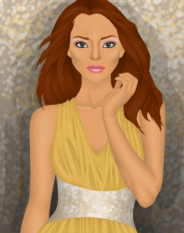
I'm slightly disappointed by this graphic. I really like your hair technique, although I dislike the hair colour. I also really dislike the colour of the dress as it fades in too much, if the dress were a different colour you possibly could have a mark higher. Pull your socks up rafael!
As much as I hate to say this, this is a step down. The skin is a strong point and the hair is nicely shaded. Once again though a very bare chest area besides the lovely collar bone. Even the dress shading is weak and this is usually a standout point of yours. I really dislike the belt as it looks very bare. I think you have the same problem as Joao, it doesn't stand out enough. As nice as the skin/hair/doll is it just merges into the background.
I love the hair! And the skin shading is excellent too! The dress could use some work, but other than that I honestly don't have too many complaints. Its just that dress, if it were a different color, and maybe had slightly better shading, it'd be a whole lot better. Other than that, fantastico!
I don't like this at all, I think the technique is average and the conveyance of style isn't there. It looks very basic and like a generic picture, not something that portrays and individuals style. I think the dress attracts quite a lot of my attention in a negative way, it's not something that's typically stylish and it's shaded rather weakly, the silver belt/waistline looks rushed and, well, to me, kinda odd, I don't think it fits with the rest of the dress style.

I really like this kasey! I was worried that your graphics were slipping but you saved yourself by making this graphic, the model doesnt have a very model like face, but you worked with it really well, love the skin and hair, you chose a good background too!
YAY! This is the Kasey I'm looking for. Your graphic last task was quite boring but I love this. The shading is amazing and I absolutely adore the bracelet. I actually love a lot of things and there isn't really anything I think you could improve on apart from the shorts. I also really like how you've opted for a nice background. It really adds a whole new depth with backdrops like this. I have so many positives to say but I'm just going to end it here with a huge well done!
Oooohhh myyyy goooddd! Gorgeous Kasey! I've been waiting for you to do something like this, and now, you have. The shading is near impeccable, although my one complaint? The short shading is a bit off, or maybe because I like structured pants. My favorite part? It'd probably be those gorgeous boots! Add a nice drop shadow, and this would be a solid ten!... With that, here's my rating:
This is a good graphic and shows the strongest technique of the bunch, but I don't think it conveys iluvladygaga's style quite right. However I think this can be let slip a little with the strength of the technique and attention to detail, the bracelet in particular catches my eye in a very positive light, and the hair is super super pretty! The one little niggle I have is in the left arm and bag, I think neither fit the graphic, and it would still look good with them omitted. I like the addition of makeup, but the face seems a little flat. Overall a good entry.
Monday, 18 February 2013

Thursday, 31 January 2013
TASK THREE - Model Behaviour
So who are the models? They have been randomly selected and they are...
iluvladygaga232 (1) & forevergorgeous (2)
Rafael: 1
Jack: 2
Kasey: 1
Afrin: 2
Emma: 1
Luisa: 2
Joao: 1
Carrie: 2
As these models have been chosen for this task I want you to focus on their face, them and their personal style. I want you to really work on the face, on the hair and on creating a signature style for the doll portrayed throughout the graphic.
Deadline: Friday 15th February
Any questions or queries just comment below.
iluvladygaga232 (1) & forevergorgeous (2)
Rafael: 1
Jack: 2
Kasey: 1
Afrin: 2
Emma: 1
Luisa: 2
Joao: 1
Carrie: 2
As these models have been chosen for this task I want you to focus on their face, them and their personal style. I want you to really work on the face, on the hair and on creating a signature style for the doll portrayed throughout the graphic.
Deadline: Friday 15th February
Any questions or queries just comment below.
Saturday, 26 January 2013
TASK TWO - Results

Wow, this is so good! Thanks for using me as the model! I look hot, haha. Great shading, your skills are improving so much, this actually deserves full marks!
First off, the shading on this graphic is impeccable, clothes and skin. It represents a summer graphic so well! The only thing I'd actually say there is some room for improvement on would be the hair but I think you know that yourself. A simple pose, but with the detailed shading you don't need it to be intricate, good work!
I really like this, you've improved so much! The hair is really amazing, not only is the shape, but the style is too. The dress is really great too, and the shading is fabulous! I honestly have no complaints other than the medoll's makeup. I'd like to see you make your own makeup instead of using the generic stardoll makeup too.
Wow, wow, wow! Amazing! Your graphics have increased immensely since your early entries in cycle two. The whole outfit is great and the work has been executed well – the denim looks, well, like denim! It can be hard to get right, but both the skirt and bra-let look fab! The details as well – you’ve clearly taken the time to work on them and get them spot on. The shoes and socks also look great. Skin shading is also wonderful, the only qualm I have is in the hand, something about it doesn’t look quite right, I think it is a little small maybe. The hair is cute and retro-styled which I do like, although I think the shading seems a bit fuzzy in places, just above where it’s tied more so on the models left than the right. Overall a great job – I look forward to seeing more of your work!
 KASEY
KASEY As much as I do like this graphic I feel like it lacks that 'WOW' factor that most of your other graphics have. I do however admire the intricacy of that jumper (which I love) and the fur looks great. I don't really think the hair goes with this specific graphic but once again that's a choice in styling rather than graphic abilities. Good work!
I think you could have done so much more with this! I'm slightly disappointed because you have all the skills but I feel like this isn't enough. The clothes are lovely but the hair does not fit and seems poorly made.
I have to agree with the others-- this doesn't have that regular stand out factor as do your previous graphics, however I do really enjoy the details you added to the outfit! The skin shading could be better, as for more definition in the collarbone, however in this case I do suppose it works. The thing I was most disapointed with was your hair, though. Normally you add so much detail and effort into your hair, however in this case, you failed to do so.
This is cute, I quite like it, and the faux fur looks not bad, though I think maybe you need to spend a little bit time doing the highlighting to a more detailed level, at the shoulders and at the top of the front it just looks a little roughly done compared to the rest. I love the bag, both the shading and the colour are just right, the sweater has clearly taken time, but I think the colour really emphasises the amount of brown in the image, to me it would look better with some lighter colours too. I think the jeans are a bit of a let down for the whole image unfortunately, they look quite rushed and don’t really have any detail to them, like buttons, pockets or zips. The hair shading is great, but something about the style looks a little odd, it almost looks like two separate hair styles put on the same head. But good job.
 AFRIN
AFRINThis definitely isn't as strong as your last task. I'm not really sure what's going on with the background first of all, it looks incredibly zoomed in and odd. I think the skin could do with a lot more highlighting and the hair could do with thicker patches of it rather than the thin lines. The face just looks too bland to me and it seems to put the whole graphic off. On the other hand I do love the jacket and dress and your technique for clothing items still impresses me.
Okay, I loved it when I first saw it but after I inspected it it looks quite weak compared to you other work. The shading on the face is very off and the hair isn't that great either, but I'm sure its just a slip!
I'm not sure exactly what to think. In some ways I really do love this, and all the effort you put into the shading, however I'm not 100% sure about the technique. It looks like a rather quick graphic, instead of something you put hours of work into. The hair is okay, but its nothing special either. On another note, I'd like to see you challenge yourself, and maybe work on the shading a tad bit more (such as changing the opacity?). I think what I'm most concerned about is that you usually use your own faces, instead of the stardoll face, which doesn't make much sense considering this is a stardoll graphic competition. Either way, I really do like the graphic, especially the jacket!
This isn’t too bad, but it’s not really something I’d see as summery. The colours seem very subdued. The skin is at the same standard as previously, though maybe focus on details some more, like in the models right neck it’s just one layer, whereas to get the realistic look that you are trying to achieve with the rest of the image, there would be muscles, tendons etc. there. I also think the nose needs a little more defining, around the nostrils it looks a little flat. The dress is nice, I do quite like it, but I feel there’s something missing – should there not be shade at the right thigh? Where it would be sitting around her leg and where it would be tucked around her knee. The jacket is also not bad, though I don’t like the pink zip or the section at her waist, it doesn’t flow with the style. The black nail polish draws my eyes in, but again, doesn’t seem summery. Otherwise, decent effort.
MARIA
I don't see improvement at all. Unfortunately the clothes look poorly made and if I'm honest the only thing I really like about it is the message.
 Hm... Your graphic last week I think was a lot stronger. You have improved on the background but the rest seems like a step back. I love the fur and the message but the face and hair are quite disappointing. Try add more layers for clothing at a lower opacity and you don't necessarily have to use black to shade! The coat would look good with brown tones in the shading too. Obviously your graphics need a lot more work but I'm sure you'll get there.
 This is just OK. The shading could certainly use some work, however the idea that you used what was given, and turned it into a trend article! Its certainly a clever idea! The hat looks strange especially when up against the hair, however that is a pretty easy fix-- just change the shape of it. The one other thing I noticed is that you didn't put a bunch of effort into the background or text. Simply by adding a casting shadow the medoll could mean life or death (in the competition)!
Ok, this is an average entry really. The idea behind it is good, the little paragraph was a nice extra touch, but the overall appearance is a little bit of a let down for me. The boldness of the black font really distracts my eye away from the graphic itself, and I don’t think that background convey’s the theme of F/W. Faux fur is a popular trend to choose, but fur is a difficult thing to make in a graphic. You’ve tried to surpass this by just making a collar rather than a whole jacket, but I think that makes it a bit weak – a full jacket would have been amazing. The graphic itself is just average, I see a little improvement on Task 1, but honestly it’s not much – the competition is quite tough, you need to spend more time working on technique and improving if you want to keep up. The shading overall is weak, all areas need to be worked on, hands, hair, clothing – it just doesn’t have the appeal that I’m looking for in a graphic, sorry.

That's certainly something worth being proud of! You seemed to change up your style (for the better) in just a few months! I like the style of the graphic, and the pose is pretty elegant too. I'm just a little weary of the skin shading, it seems like the light is coming from all different angles, instead of one particular source. Also, the flowers could use a bit more work, it just looks like you blurred the one or two layers of shading, and that's it. In other news, the side pose is quite spectacular!
Wow! I really love this, it's so chic and sexy! Not a fan of the wreath though, but the shading and highlighting are both really good, you've improved!
I wasn't expecting this! It's very nice and draws your attention to it even though it's reasonably simple. The skin shading is great and I love those shorts. The only thing I'm not keen on is the wreath but apart from that it is amazing. The only thing I'd say you could improve is use one source of light as it looks like it is coming from all directions but well done.
I don’t see Karlie in this at all, it doesn’t represent her well. Graphic-wise, it’s ok, you’ve definitely improved from seeing your previous works. The skin looks alright, but be careful when using the white in big chunks, try a couple of layers instead – just in the arms really, it’s most noticeable at the shoulders. The shorts are nice, I quite like them, but be careful with placing the highlight on the areas in proportion to where the light is coming from. The bralet is also nice, but I think the shading looks a little flat in places, like at the underneath of the breasts. I think the flowers need most work, each of them is shaded to a different extent, I think just hair would have suited the graphic better, the flowers make it almost too fussy, and like there’s a bit much going on. Not bad overall though.
 LUISA
LUISAThis represents F/W so well and that is why it's my favourite this time around. The only main area I see for major improvement is the hair but aside from that the jacket's shading/highlighting looks slightly blurred and amateur. I just love the concept though, this is a great second task.
OMG! Jaw dropping, this is FA BU LOUS! Spectacular girl! I love the theme and the idea of this graphic, I love military! kudos to you!
You are certainly one of the more experienced graphic designers in the competition! Not only is your technique different from the others, but your concept of shading is quite spectacular! What impresses me the most though, is I only remember you starting graphics a few short months ago. With that said, you are definitely very talented! My only comment is that the shading seems a tad light for my liking. I think maybe adding darker shadows should do the trick (especially in the hair)... Fantastic!
I love this a lot! It’s captured the season well as well as portraying the trend nicely! I love the hat so much – it’s clear you’ve spent time working on it, and it’s really paid off; it’s exactly how I think the faux fur should look. The face shading is good, though the nostrils almost look a bit odd being completely black. The hair’s okay, though I find I’m not that busy looking at it as I’m so focused on the great parts =) The jacket looks awesome and the details have been clearly thought about, those military style badges look wonderful. The only thing I’d say is about the sleeve definition on the models right, it looks a little blended to the body compared to the left – but it’s hardly major! The snow looks cute too ^^ Great job!

I love the use of a male model in this. The quilting on this jacket is tremendous, the hair is great, the cheek shading is good and quite honestly all the clothes are good. The hands could be shaded darker slightly but aside from that I love it, good work. I would have also loved to have seen a fiercer face. (blue eyes, stronger brows etc)
This is a big improvement on Task 1 – well done! I love that it’s a male model, makes it different and stand out in the crowd. The one thing I think lets it down is the face – to me it’s not male model at all, which is a shame. I love the black and navy use; it’s one of my top colour combinations. The leather jacket is great, the attention to detail is good, and the quilting pattern looks amazing. My only thing is that is doesn’t seem very A/W, like it doesn’t strike me as that right away when looking at it. Not a bad job overall though.
I love it! The detailing is amazing and it's a very strong entry, well done.
There's the final product to that amazing jacket! The shading is near impeccable, such a HUGE improvement from your last graphic! I really like the hair shading and style, and the clothing is pretty good too. I agree, using a male model was really clever! The one thing that could use improvement though is those hands. They look a bit too lightly shaded, and I'm not sure if you got the shading in the right places either. Never the less, this is fabulous!
JOAO
 To be honest I’m not much of a fan – I think mainly because of the background. You’ve posterised and added your graphic, but I don’t feel the two connecting, mainly in the hand where you wanted it on the wall. I also think the skin tone and the background have a very similar colour palate, personally I find it a bit distracting. The hairs not too bad, though I think the shading looks a little half done, some parts have been shaped nicely whereas others haven’t. The skin looks rushed, and although you have tried to include details, such as where shadows from the clothing would sit, it just hasn't been done too well. Kinda the same with the clothing and shoes, looks rushed though you’ve attempted to include details such as seams on the top. I definitely think there’s a lesson to be learned by rushing a competition entry.
 I have to say this seems like quite a large step back from last time. The background and model fail to merge at all and the skin looks very poorly shaded. They're looks like there is a blur between everything and the face looks disconnected. I am aware you had to rush this but I expected more.
Wow, this reminds of DKNY for some reason, which is great! It really gives of the new york summer vibe. The shading needs a lot of work and the hair is very flat but overall I like it!
All I can really say is that this graphic is just ok... there's nothing special about it, nor is it something horrible either. The shading is fine, however I'm not sure if the highlighting was needed.... it just makes the model look plastic in this photoshoot. The one thing I do like is the shirt, its certainly fierce, and I'm happy that you took the risk contrasting it from the rest of the graphic. I'm not sure about the face either... it looks a different shade from the rest of the body... which I absolutely... *shivers* --I'm not sure if adding that background was the right choice either...
 CARRIE
 I like the idea but I don't know, the graphic is weak. The clothes are nice but the shading is poor like most other things. I hope this isn't the last time we see you.
It's a huge step up from last week and I will give you that. You are definitely going in the right direction and that's what we like to see! I really don't think the skin is shaded that badly, just darken up the layers a bit more and you're well on your way. This goes for everything as pretty much all areas seem quite flat. It's nice though and so much better than last time. Work on your hands too, they look awkward and it's so easy to make hands look bad, take your time.
Very summery, and I’m glad to see you including an appropriate background. The first thing I notice is the hands, they look (and probably are) back to front – the thumb should be at the front, and the pinky most likely wont be seen, it’s physically impossible for hands to be like this. It really stands out to me, so puts me off a lot unfortunately. Overall it’s an improvement for you though, but there is still a way to go. The rest of the skin isn’t too bad, but be wary at the breasts with the shading of the top, the two should be complimentary, but they look like they’ve been done to different shapes almost. The clothing shading is better than before, but is still basic, think about the details and using layers to build up the colour, for example on the stitched parts on the shorts use more than one layer, they still look rather flat, as does the top. The denim waistcoat … is ok, but I think the graphic would have been better without it, it doesn’t really fit the yellow sort of theme you have going. The hair is also improved, but it looks rushed and quite blurry – take some time away from your NTGD entries and work on little skills like that, even if it’s just one basic hairstyle you master it’ll still help improve the overall appearance of your work.
This is actually a huge step up from your previous entry... I love those shorts, they want me to own a pair for myself! The shading isn't bad, however the hands are pretty awkward and poorly shaded-- I cannot decifer one finger from the other, which is something that clearly needs worked on. The hair isn't too bad, however I think you should have added more definition into the shadows, and not just because I'm a sucker for high definition, but in the end it looks better too. The vest looks a bit strange too, especially in the seams lines, it sort of looks like the strip of fabric holding the buttons is floating. Also, for sure check the internet for some jeans tutorials, that would have added a much bigger appeal to the vest already! None the less, this is a huge improvement!
So who goes?
CALL OUT ORDER:
(According to all entries)
1. Jack
2. Rafael
3. Luisa
4. Emma
5. Kasey
6. Afrin
7. Joao
Which leaves Carrie and Maria in the bottom two.
Unlike other seasons where I would deliberate with the judges on who should be eliminated, the elimination will be purely based on scoring from the whole of the competition.
So who has the lowest amount of points?
Monday, 14 January 2013
Fun + A Small Competition
Hello! As I said in previous posts, I wanted to make the blog slightly more interactive with readers as previously there would only be roughly two posts a month. Stardoll is pretty bare with competitions right now, so I'm going to hold one on here!
THE COMPETITION:
I want to see if we can get 30 comments on this post.
Comment below with your medoll's username and once the commenting has stopped I will use a random name generator to pick two medolls. These medolls will then become the model for half of the graphics for the next task each.
I will talk more about the task when the time comes, but for now, get commenting!
THE COMPETITION:
I want to see if we can get 30 comments on this post.
Comment below with your medoll's username and once the commenting has stopped I will use a random name generator to pick two medolls. These medolls will then become the model for half of the graphics for the next task each.
I will talk more about the task when the time comes, but for now, get commenting!
Thursday, 10 January 2013
Achievements
http://thedollianawards.blogspot.co.uk/
Click the link to view other categories and winners.
We won 'Best Contest' over at The Dollian Awards. Thank you to everyone who voted and I really appreciate it! I feel like this is one of the best competitions to come to Stardoll in a while and I'm very happy about the user participation involved with it.
In other news, we are edging closer towards 30,000 views on the blog! Considering this blog has been going for less than a year and we're already on the third season I'm proud of how far we've come in this short space of time and I hope it keeps going!
Thank you,
Kimberly. :-)
Click the link to view other categories and winners.
We won 'Best Contest' over at The Dollian Awards. Thank you to everyone who voted and I really appreciate it! I feel like this is one of the best competitions to come to Stardoll in a while and I'm very happy about the user participation involved with it.
In other news, we are edging closer towards 30,000 views on the blog! Considering this blog has been going for less than a year and we're already on the third season I'm proud of how far we've come in this short space of time and I hope it keeps going!
Thank you,
Kimberly. :-)
Monday, 7 January 2013
TASK ONE - Results + Task 2
Hello everyone and welcome to the first feedback post of season three!
Judges: hollyoaksrocks*, xxlovexx, sparklewand12
Comments are in no particular order.
 Wow! I think this portrays Kate Moss extremely well. Your graphic altogether is strong but I think you need to work a tiny bit on neatness. Take Lana as an example, you will almost never find an imperfection in her shading because she makes sure all of it is tidied. Your far shading however is extremely good, and it's definitely a strong first task!


 This is one of my favourites this task! Not only are the graphics pretty good but this represents the model perfectly! I'd like to see a little thicker shading but aside from that it's a very strong graphic, well done, a very good first impression.
I can really see Freja in this with the body language and the hair. But I’m not sure I see it in the face, could just be me though. I also think there’s a little something not quite right with the head positioning with the hair at the models right side, I think the hair just seems a little big and the parting not quite at the right angle. The clothing is pretty good, some cute little details would really show off extra skill and put it at a place above some others in the competition. The skin isn’t too bag either, but one thing that stands out to me (and I know this may be pernickety) is the lack of fingernails on the left hand – sure enough they won’t be large and most people won’t notice, but it’s little details which help make someone stand out to me, and fingernails are one of those details. Overall a solid performance!
Wow, Nice burst of colour! I love the jacket colour. I've never heard of this model but you've made a good first impression of her, You should try and work with anatomy and find the right angles etc, but great job though!

KASEY
Well Kasey, I don't know what to say really, I can't say i like it, but I can't say i dislike it, I think the head is overly large and you could of looked into Cara's style alot more, This is the most important one to me, as Cara is my all time favourite model, but all in all you did a good job.
I can't fault the graphic because it is beautiful. You have got your technique down and you work with it so well. I especially love your models use with props in the graphic as I think often designers plot their dolls randomly on a background and it just doesn't fit. The main downfall to this graphic is I don't really see Cara in it too much. Your other one was slightly more into Cara's style, but I selected this one down to the fact it's graphically excellent! Well done.
It’s nevertheless a good graphic, but I don’t really see Cara in it. I think the eyes and eyebrows portray her most, but I think the rest of the face doesn’t quite seem … Cara. I know you didn’t need to make the graphic look identical to the model, but I think it really would have helped. It might just be me, but after looking at the image a few times the head seems a little large for the body. I think it’s a good solid graphic from you, but I somewhat feel that it could have been better – for example details on the skirt and blouse would have added an edge and really shown your skill to your competitors.
 MARIA
MARIA
Hmm, you have become a lot better honey, but this is lacking the X factor, For the background you should of posterised or cartoonised the grass as it just doesn't look right at all, I like the dress though.
I’ll be honest with you and say I don’t really see this as Lara Stone, and I don’t feel that it’s that strong of a graphic – you’ve been a contestant before, that has given you the chance to see what it’s like and see what you need to do to stay in the competition. I feel that it looks a bit rushed, things like the shape, particularly at the right wrist and hand it looks roughly drawn. The face looks only lightly worked on, it’s hard to tell about the bone structure, which is a striking feature of Lara. The background also puts me off a little, it just looks like an enlarged picture of grass, it’s not very attractive. Good effort though.
Hm, I do faintly see Lara Stone in this graphic but I can't concentrate on it for too long without noticing that background. So many people making graphics seem to forget about how important backgrounds are. I don't know whether she's lying or standing and it confuses the graphic. You could have even got grass from your scenery or suite from Stardoll and put it as the background so it would fit more. Shading wise however I like this graphic! The shading on the arms is good and the hair is nice. The dress is alright but could be better with some more definition, well done for making your own face!
LUISA
 In the face I don’t see much of Carolyn, however I feel that you’ve
taken a lot about her work into consideration, as a lot of her photos
are swimwear, which is what I think of when I hear Carolyn’s name. I
like the overall graphic, the backgrounds flows nicely from the graphic
and it really seems natural, which is what I like to see =) You have
quite a different skin technique to most graphic designers I’ve seen,
and I really like it, I think it really works for you. I also think it
flows into your clothing technique so that the image fits together
nicely. I really do love the jacket! The only thing I’m not so fond of
it the hair, I think the front doesn’t look quite right, maybe a bit too
rough? It almost doesn’t quite fit with the rest of the style, but it’s
only a small thing. Overall, a really good entry!
In the face I don’t see much of Carolyn, however I feel that you’ve
taken a lot about her work into consideration, as a lot of her photos
are swimwear, which is what I think of when I hear Carolyn’s name. I
like the overall graphic, the backgrounds flows nicely from the graphic
and it really seems natural, which is what I like to see =) You have
quite a different skin technique to most graphic designers I’ve seen,
and I really like it, I think it really works for you. I also think it
flows into your clothing technique so that the image fits together
nicely. I really do love the jacket! The only thing I’m not so fond of
it the hair, I think the front doesn’t look quite right, maybe a bit too
rough? It almost doesn’t quite fit with the rest of the style, but it’s
only a small thing. Overall, a really good entry!
I'm a bit on the fence. First off, I love how you've really taken the model into consideration and I really LOVE the denim jacket. I'm really not fond of the hair but that can easily be improved. The thing I'm not sure about is the skin shading, you've made it more realistic by not necessarily just doing it at the edges of the skin. I don't really like the shading on the legs but everyone has their own opinion on shading techniques.
I've missed seeing your graphics, This is so good, You've really portrayed the model well, I just think it would of been amazing if you had a different hair style.
 RAFAEL
4. Afrin
5. Maria
6. Carrie
TASK 2
Seasons are an important part of the fashion world so I will be giving you all seasons in which you will research the trends for. You must pick a trend from that season and make a graphic with it. 4 of you will be doing S/S and 4 F/W.
Rafael - F/W
Luisa - F/W
Kasey - F/W
Maria - F/W
Jack - S/S
Afrin - S/S
Carrie - S/S
Joao - S/S
Deadline - 19th January
If you have any questions or queries just ask in the comments below, good luck!
Judges: hollyoaksrocks*, xxlovexx, sparklewand12
Comments are in no particular order.
JACK
 Wow! I think this portrays Kate Moss extremely well. Your graphic altogether is strong but I think you need to work a tiny bit on neatness. Take Lana as an example, you will almost never find an imperfection in her shading because she makes sure all of it is tidied. Your far shading however is extremely good, and it's definitely a strong first task!
Esto es increíble belleza que poco! I think you've portrayed kate moss so well. The smoke on that cigarette is well made, im not really fan of the no makeup look you gave her, but all in all, GOOD JOB!
Very nice, and very Moss-esque, you really have worked carefully to
portray her well. It shows a lot of improvement from your entries in the
last cycle. I can see close attention to details, such as the buttons,
but I think maybe a little more time on the face would make it even
better, just to make the features that little bit more prominent as
they’re quite pale in comparison to all the black. Overall a good job
though!
AFRIN

I really like this! Although it is a different style of shading to what most people use I think it works very well (in this case) but I'm not sure what it will be like for other graphics. Overall I think you've done a great job!
You've done a really good job! You've improved a ton and this is very well executed.
I do quite like this graphic, though I’m not sure I’d be able to
identify who it was if I hadn’t known that Marloes Horst was your model,
it might just be me, but she definitely reminds me of Daphne
Groeneveld. Your graphics technique in places reminds me of my own back
before I was in cycle 1, which for me wasn’t really great nor would it
lead to large improvements, I almost feel this may happen with you as
well. I know the original image, I think you’ve done ok to make it your
own, but I would just say to take note of some details which you have
omitted, mainly in the shorts as there’s a lot of blocked colour there.
Overall not a bad first impression you’ve given us!
CARRIE

I really don't see Chanel Iman in this. When you see her you see a fun bubbly girl and this looks very lackluster compared to what she is really like. You need to work on your shading because this graphic is so bare without it. It takes time and you have to have a lot of patience with it but it does pay off. Next time try and delve a little deeper and experiment more with techniques to find what works for you? I look forward to seeing what else you can do!
I'm sorry but I don't even know who this is. The hair is badly made and there in no shading or highlighting in the skin what so ever, I like the cleanliness of the graphic though, nice and simple.
I think this graphic is a starting point, but I think a lot of work is
needed as it’s a rather plain graphic. It’s alright as Chanel, but when I
see it I don’t think of her. It might just be me, but the facial
features look rather blurred, which I think will be when you’ve resized
it after taking it from SD, there’s also no extra shading done on the
face, when you think of models, most people will think of the cheekbones
so they’re important to remember. Adding shading work to the face also
helps it become less 2D, which is something I learned when I was a
contestant, and it’s like the ABC’s of graphics now for me. In general I
think you need to work on your technique in all aspects (hair, skin and
clothing), in most places it hasn’t been thought about carefully enough
and seems a little rushed, for example in that there is minimal skin
shading. I think with the right pushing you could become a good graphic
designer, but it will take time and effort. I look forward to seeing
your next entry though to see how you’ve taken tips and such =)
JOAO

I can really see Freja in this with the body language and the hair. But I’m not sure I see it in the face, could just be me though. I also think there’s a little something not quite right with the head positioning with the hair at the models right side, I think the hair just seems a little big and the parting not quite at the right angle. The clothing is pretty good, some cute little details would really show off extra skill and put it at a place above some others in the competition. The skin isn’t too bag either, but one thing that stands out to me (and I know this may be pernickety) is the lack of fingernails on the left hand – sure enough they won’t be large and most people won’t notice, but it’s little details which help make someone stand out to me, and fingernails are one of those details. Overall a solid performance!
Wow, Nice burst of colour! I love the jacket colour. I've never heard of this model but you've made a good first impression of her, You should try and work with anatomy and find the right angles etc, but great job though!

KASEY
Well Kasey, I don't know what to say really, I can't say i like it, but I can't say i dislike it, I think the head is overly large and you could of looked into Cara's style alot more, This is the most important one to me, as Cara is my all time favourite model, but all in all you did a good job.
I can't fault the graphic because it is beautiful. You have got your technique down and you work with it so well. I especially love your models use with props in the graphic as I think often designers plot their dolls randomly on a background and it just doesn't fit. The main downfall to this graphic is I don't really see Cara in it too much. Your other one was slightly more into Cara's style, but I selected this one down to the fact it's graphically excellent! Well done.
It’s nevertheless a good graphic, but I don’t really see Cara in it. I think the eyes and eyebrows portray her most, but I think the rest of the face doesn’t quite seem … Cara. I know you didn’t need to make the graphic look identical to the model, but I think it really would have helped. It might just be me, but after looking at the image a few times the head seems a little large for the body. I think it’s a good solid graphic from you, but I somewhat feel that it could have been better – for example details on the skirt and blouse would have added an edge and really shown your skill to your competitors.
 MARIA
MARIAHmm, you have become a lot better honey, but this is lacking the X factor, For the background you should of posterised or cartoonised the grass as it just doesn't look right at all, I like the dress though.
I’ll be honest with you and say I don’t really see this as Lara Stone, and I don’t feel that it’s that strong of a graphic – you’ve been a contestant before, that has given you the chance to see what it’s like and see what you need to do to stay in the competition. I feel that it looks a bit rushed, things like the shape, particularly at the right wrist and hand it looks roughly drawn. The face looks only lightly worked on, it’s hard to tell about the bone structure, which is a striking feature of Lara. The background also puts me off a little, it just looks like an enlarged picture of grass, it’s not very attractive. Good effort though.
Hm, I do faintly see Lara Stone in this graphic but I can't concentrate on it for too long without noticing that background. So many people making graphics seem to forget about how important backgrounds are. I don't know whether she's lying or standing and it confuses the graphic. You could have even got grass from your scenery or suite from Stardoll and put it as the background so it would fit more. Shading wise however I like this graphic! The shading on the arms is good and the hair is nice. The dress is alright but could be better with some more definition, well done for making your own face!
LUISA
 In the face I don’t see much of Carolyn, however I feel that you’ve
taken a lot about her work into consideration, as a lot of her photos
are swimwear, which is what I think of when I hear Carolyn’s name. I
like the overall graphic, the backgrounds flows nicely from the graphic
and it really seems natural, which is what I like to see =) You have
quite a different skin technique to most graphic designers I’ve seen,
and I really like it, I think it really works for you. I also think it
flows into your clothing technique so that the image fits together
nicely. I really do love the jacket! The only thing I’m not so fond of
it the hair, I think the front doesn’t look quite right, maybe a bit too
rough? It almost doesn’t quite fit with the rest of the style, but it’s
only a small thing. Overall, a really good entry!
In the face I don’t see much of Carolyn, however I feel that you’ve
taken a lot about her work into consideration, as a lot of her photos
are swimwear, which is what I think of when I hear Carolyn’s name. I
like the overall graphic, the backgrounds flows nicely from the graphic
and it really seems natural, which is what I like to see =) You have
quite a different skin technique to most graphic designers I’ve seen,
and I really like it, I think it really works for you. I also think it
flows into your clothing technique so that the image fits together
nicely. I really do love the jacket! The only thing I’m not so fond of
it the hair, I think the front doesn’t look quite right, maybe a bit too
rough? It almost doesn’t quite fit with the rest of the style, but it’s
only a small thing. Overall, a really good entry!I'm a bit on the fence. First off, I love how you've really taken the model into consideration and I really LOVE the denim jacket. I'm really not fond of the hair but that can easily be improved. The thing I'm not sure about is the skin shading, you've made it more realistic by not necessarily just doing it at the edges of the skin. I don't really like the shading on the legs but everyone has their own opinion on shading techniques.
I've missed seeing your graphics, This is so good, You've really portrayed the model well, I just think it would of been amazing if you had a different hair style.
 RAFAEL
Wow honey, this is amazing! I love it so much, Daphne is absolutely gorgeous and so is your graphic, I love the detail you have put into this, It really gives the Vogue vibe!
I’m a little on the fence with your graphic, I do quite like it, but I’m
not sure I see Daphne. The lips are spot on for her, but I feel it
would be more effective with the eyes open. I know they’re closed in the
original, but still. I like how you’ve changed it up a bit from the
original with the I think it really pops a lot. I also like the hair,
which I can see has had a lot of effort. The skin is ok, but the neck
and chest seem quite stiff and strained, I’m not sure if these are the
right words or that anyone will understand what I mean, and I get that
the neck muscles will be extended due to the head position, but it just
doesn’t look quite right – maybe it’s too precise, if you get what I
mean? Anyway, not too bad a job!
Wow! I love this and I can tell exactly who it is at first glance! I do however agree that the graphic would look better with open eyes, but the shut eyes definitely work! The chest looks slightly under shaded and the neck looks somewhat stiff due to the positioning of the head. I'm not sure if that makes sense but it just doesn't seem to flow as well. Seriously though, well done, this is an extremely good entry from you.
I'm not revealing the exact scores as they will be what determines who wins but I will post what order everyone came in. If names are bold that means they are in joint places with the person below them.
1. Rafael
2. Jack, Luisa
3. Kasey, Joao
5. Maria
6. Carrie
TASK 2
Seasons are an important part of the fashion world so I will be giving you all seasons in which you will research the trends for. You must pick a trend from that season and make a graphic with it. 4 of you will be doing S/S and 4 F/W.
Rafael - F/W
Luisa - F/W
Kasey - F/W
Maria - F/W
Jack - S/S
Afrin - S/S
Carrie - S/S
Joao - S/S
Deadline - 19th January
If you have any questions or queries just ask in the comments below, good luck!
Subscribe to:
Posts (Atom)